Patterns
Help users to…
Navigate benefit applications
Also known as: Benefit applications
Use: DeployedEach benefit application has four epics: Eligibility, How to apply, Apply now, and After you apply.
Structuring benefit applications in this way has, through rigorous usability testing, demonstrably improved how to educate users about the benefits and how to set expectations about the application process. For the Department of Veterans Affairs, this means that applications are more accurate and complete, so the Department to better serves its constituents.
Eligibility
For Veterans, determining whether or not they (or their beneficiaries) are eligible for a specific benefit is a difficult process. The policies governing those benefits can be complex, fraught with dependencies and variations that can be overwhelming.
The associated pattern of content and functionality designed to help users of the website understand their eligibility, therefore, needs to accomplish a few things which can seem at odds with one another. Manifested as a single page, it should:
- Provide a simple introduction to eligibility rules that covers the most common scenarios.
- Scale (expand) to represent variations in complexity.
- Prevent users from going to the wrong form.
- Provide the ability to announce changes in the law or availability of benefits that may impact their eligibility.
- Provide space to connect users to benefits that are likely to be related to their question about the benefit they are viewing.
- Guide users to the next logical step in determining their eligibility, ultimately concluding getting them to the proper benefit application.
Eligibility hierarchy
The hierarchy of the eligibility pattern allows it to be flexible enough to cover simple or complex benefit eligibility information while still feeling straightforward and easy to follow. Generally, the eligibility pattern manifests itself as a single web page. It sits within a benefits hub based upon the following rules:
- For benefits hubs with a single benefit (such as Health care), we link to a separate Eligibility page as well as How to apply page from the hub landing page.
- For benefits hubs with multiple benefits (like Life insurance), we link to the main options/Eligibility page from the hub landing page. From this page, the user can choose the option for which they want to explore their eligibility.
- For a benefits hub where there is only a single benefit available, such as Veteran’s Pension, we link directly to the Eligibility and page for that benefit from the hub landing page. We also link to pages for other, related benefits (Aid and Attendance, and Survivors Pension) from the hub.
The eligibility page consists of the following elements:
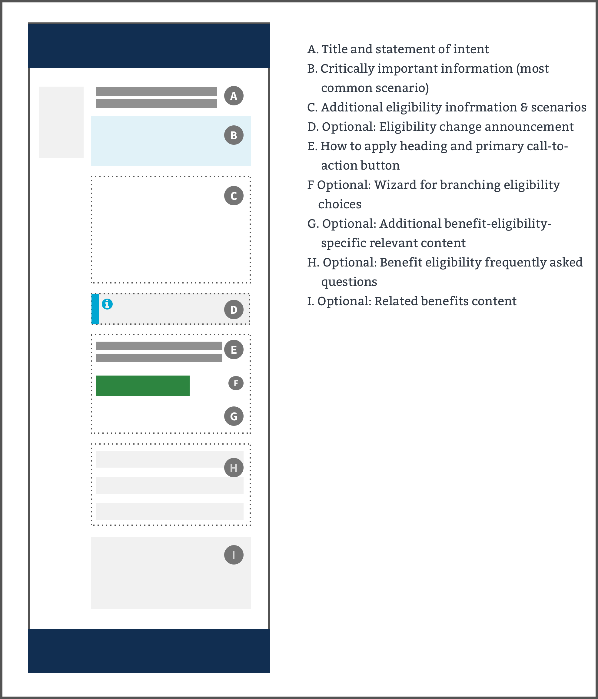
A. Title and statement of intent
The title should be “Eligibility for (Most Commonly Used Benefit Name).” The statement of intent should state the job the page will do for the user, by stating something like “Find out if you are eligible for (most commonly requested benefits, described in plain language). This allows a user to quickly assess if they are in the right place, and it helps search engines highly rank these pages for appropriate searches.
B. Critically important information (most common scenario)
The featured content component is used to present the user with the most commonly sought benefit eligibility scenario. Some benefits are complex and contain several optional paths to confirmation. It is not acceptable to repeat this element on the page; instead use the Additional eligibility information & scenarios element for other variations. Note: please do not use this pattern more than one time on the page as it decreases its effectiveness at drawing the eye to the most likely sought content.
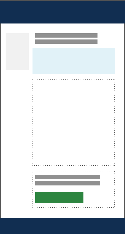
Do
Use a single featured component for the most common scenario.
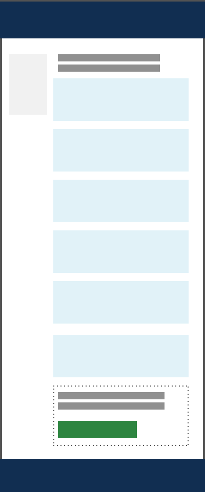
Don’t
Use two or more featured components for multiple scenarios, because there can't be more than one that is the most common. Use other page elements for this purpose.
View the Summary box component
C. Additional eligibility information & scenarios
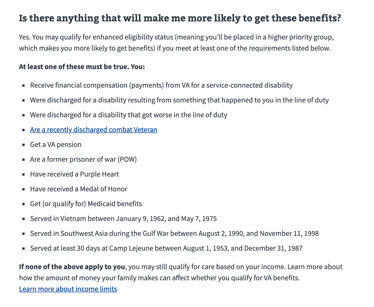
Benefit eligibility or requirements information that is more nuanced than the summary placed inside the Common scenario overview (featured content component), including different requirements for sub-audiences, application assistance, etc. Group prerequisites logically by benefit type, and order benefit types from most common to less common.
D. Optional: Eligibility change announcement
When time sensitive content about a benefit — such as a new benefit being made available or a significant change in the laws around eligibility for a particular benefit — you can place an informational alert on this page. Follow the recommendations governing alert usage, including
- Use informational alerts to announce upcoming benefits
- Use informational alerts with expandable content to hide detail that may not apply to everyone visiting the page
E. How to apply heading and action links
A brief heading should precede and call attention to the sub-task link or action link. This heading can be followed by an optional single sentence of text or phrase if necessary.
If your page uses the Help users to complete a sub-task pattern, use a secondary action link. If the page does not have a help users to complete a sub-task pattern and you want to direct your user to the application flow, use a primary action link. This action link is a visually prominent link that will bring the user to another page.
Having an action link on the page helps the user follow the most logical path. Note: Avoid putting more than one action link on the page. If you have a page that requires multiple benefit form links, use the pattern for helping users to complete a sub-task to create branching logic to get the correct benefit application (or prevent a user from applying to the wrong benefit).
The action link can be followed by item 6, Additional Benefit-Eligibility-Specific Relevant Content, if necessary.
Accessibility considerations
Screen reader users can’t scan a page visually to immediately know that there is content below any particular action item such as an action link. So, if they come across a key call to action, there is no guarantee or certainty that they will know that more information, that may be important to that call to action, could exist beyond that call to action. Therefore, please be mindful about placing important content below the key call to action.
F. Optional: Help users to complete a sub-task pattern for branching eligibility choices
In the case where there are multiple benefit options, the pattern for helping users to complete a sub-task allows a user to branch into the appropriate benefit application from the eligibility page.
The text of the action link should represent the job the sub-task is performing, such as “Find your education benefits form”.
G. Optional: Additional benefit-eligibility-specific relevant content
Any additional content necessary that is connected to the primary benefit eligibility use case for the page can be added here.
H. Optional: Benefit eligibility frequently asked questions
Use the accordion component to present questions that are common about eligibility for a benefit.
I. Optional: Related benefits content
Any additional benefits (e.g. vocational benefits eligibility that is related to education benefit eligibility) can be added to the bottom of the page using the RELATED PAGES component.
How to apply
This is a high-level description of the “How to apply” page for benefit applications. The content recommended for the “How to apply” page may overlap with the “Eligibility” or “Apply now” sections.
Page title
The page title should be “How to apply for (Most Commonly Used Benefit Name).”
Introduction
The introduction describes what the page is about. For the “How to apply” page, the introduction text includes the following:
- The benefit(s) the application is for
- The type(s) of users the application is aimed at (Veteran, service member, qualified family member)
- A link back to the Eligiblity page to send users to the Eligibility page to ensure they’re eligible for benefit
- SEO keywords (See Writing for SEO.)
Preparing to apply (informational callout)
On the “How to apply” page, use the featured content component to present chunked, scannable snippets of critical information needed by the majority of applicants to apply. For example,
- Describe what a user needs to do before they begin the application
- List items needed to complete the application (SSN, military history, etc.). Required items should be called out.
Note: The featured content component should only be used for the most important information on the page. Since it includes critical information, featured content should appear near the top of the page.
How do I apply?
The “How do I apply” section lists possible application methods. It should emphasize the optimal path for Veterans, (which may be how to get help from a human instead of online help.) Some common application methods are:
- Online
- Wizard button If your page has a wizard, use a primary green button. We reserve buttons for those actions that trigger on the page, in this case a wizard mini-form interface allowing the user to self-select into (or out of) the appropriate benefit form.
- Action link If the page does not have a wizard and you want to direct your user to the application flow. Use a primary green action link. This action link is a visually prominent link that will bring the user to another page.
Note: never put more than one green button or green action link on the page. If you have a page that requires multiple benefit form links, use the wizard mini-form interface to create branching logic to get the correct benefit application (or prevent a user from applying to the wrong benefit).
- By mail
- Link to the printable application form
- Instructions for mailing the completed, printed form
- In person
- Link to find nearest VA regional office
- With the help of a trained professional
- Link to get help
What happens after I apply?
The “What happens after I apply” section sets the user’s expectations about what will happen next in the application process. This section may include:
- Concise content or a link to a page describing what the user can expect after they apply
- A call to action (primary blue button) that allows the user to track the status of their application
- A card that sets the user’s expectation for how long it takes to receive a response
Optional: More information
Include the “More information section” if there is helpful supporting information about applying for the benefit.
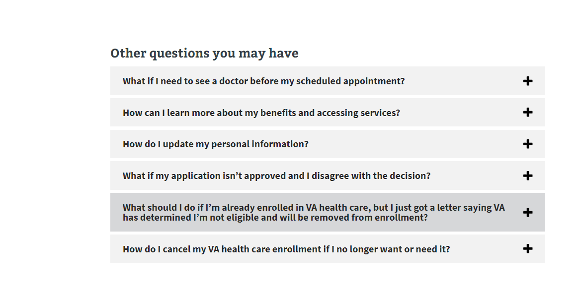
- For many short content items, consider using the accordion component to reduce the content on the page.
- For longer content items, consider linking to a separate page.
Live page examples
- How to apply for VA health care
- How to file a VA disability claim
- How to apply for the GI Bill and other education benefits
- How to apply for a VA pension as a Veteran
Apply now
The “Apply” page is the start of the react app and indicates the beginning of the form. It isn’t a static page. This page is separate from the static “How to apply” page, and repeats some eligiblity and how to apply information in case users navigate to this page from somewhere outside of VA.gov.
Page title
The page title should be: “Apply for [benefit type]”. For Disability, the page header should be “File for disability compensation”
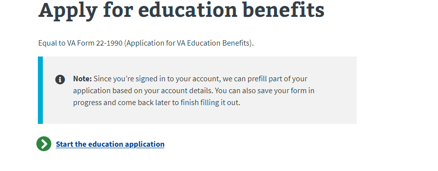
Under the page header is the VA paper form equivalency. This shows the equivalent VA paper form that the online application corresponds to.
For example: Equal to VA Form 21-526EZ (Application for Disability Compensation and Related Compensation Benefits).
Sign-in message
At the top of the introduction page, is a sign in message. There are two different messages depending if a user is signed in or if the user isn’t signed in to their account.
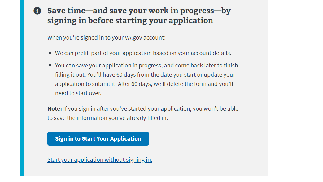
Message when a user isn’t signed in:
- Lets applicants know that by signing in some information from their profile account could be prefilled into the application and that they can save their work as they go.
- Gives time on how long the application will be saved for
- Blue CTA button Sign in to start your application
- Link to fill out the application without signing in. (For all online applications except for Disability Compensation)
Message when a user is signed in:
- Lets applicant know they are signed in and can save their work as they go
- Primary action link
Subway map
Subway or process map shows the steps the users needs to take to apply for a benefit. The headings are action words, short and concise, and consistent across forms.
Prepare
- Gives the applicant the information they’ll need to fill out the form, such as if they need to submit any documentation or provide their SSN, bank information, military history, spouse information, etc.
- Items that are optional are called out.
Apply
We use the same language for this step across all forms:
Complete this [benefits] form. After submitting the form, you’ll get a confirmation message. You can print this page for your records.
What if I need help filling out my application? An accredited representative, like a Veterans Service Officer (VSO), can help you fill out your claim.
[Get help filing your claim]
VA review
The step tells applicants how much time it takes VA to review the application. The content under this heading depends on what type of benefit they’re applying for. For example:
- For Health Care form, the message is: We process health care claims within a week.
- For Education forms, the message is: We usually process claims within 30 days. We’ll let you know by mail if we need more information.
-
For Disability Comp form, the message is: We process applications in the order we receive them. We may contact you if we have questions or need more information. The amount of time it takes to review your claim depends on:
- xxxyxlxlx
- xxxyxlxlx
VA decision
This step sets the user’s expectation for when they will receive a response. It tells applicants how and when they will be informed of the status of their application (if denied or approved).
OMB information
This appears at the bottom of the Apply page and shows:
- Respondent burden
- OMB control number
- Privacy act link
Need help?
This footer appears on the bottom of every page of the form. It includes phone numbers if an applicant needs more support or has questions about filling out the form.
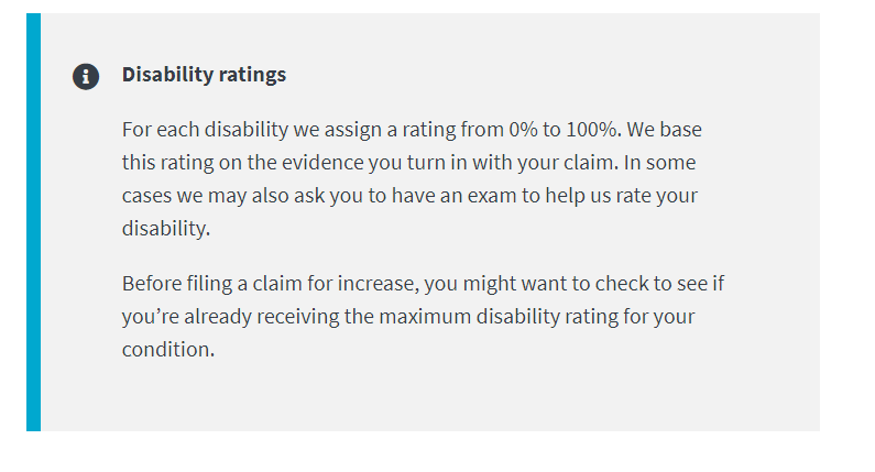
Optional: Other components on the Apply page
Depending on the type of benefit, an alert is sometimes included with specific inforomation or detail about that benefit.
This is an optional component and should only be used if there is an important benefit or application process to call out to the applicant.
Live page examples
File for disability compensation introduction page
Apply for education benefits introduction page
Apply for Pre-need eligiblity introduction page
Apply for Veterans pension introduction page
After you apply
This is a high-level description of the “After you apply” page for benefit application.
Page title
The page title should be: “After you apply for (Most Commonly Used Benefit Name).”
Introduction
The introduction describes what will happen next in the application process after an applicant submits an application. This section may include:
- What an applicant needs to do after they submit their application.
- SEO keywords (See Writing for SEO.)
When will I hear back about my application?
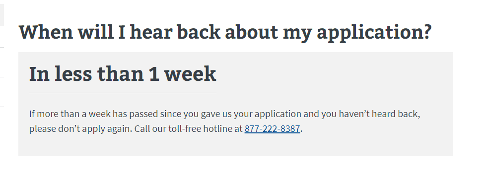
This section appears as card or gray alert that sets the user’s expectation for how long it takes to receive a response, and includes:
- Content or a link to a page describing what the user can expect after they apply
- Time frame for how long it takes to receive a response
Health care:
Education:

Disability compensation:

Optional: Other components on the “After you apply” page
Below is a list of optional components that appear on the “After you apply” page.
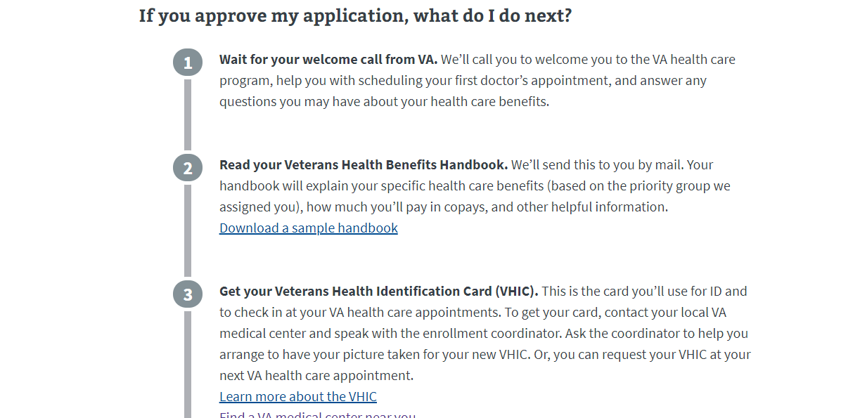
Subway process map
View the subway map component.
Health care:
Accordions
Health care:
Call-to-action button or action link
Use a button for a clickable action on the page. Use the action link if you are navigating the user to another page.
View the action link component.
Disability compensation:
