Components
Process list
Use: Deployed USWDS v3
Examples
Default
View va-process-list default in Storybook
Status
View va-process-list status in Storybook
Header Size
View va-process-list header size in Storybook
Custom Sizing
View va-process-list custom sizing in Storybook
Usage
Refer to the U.S. Web Design System for usage guidance
Additional guidance for VA
Additional uses of a process list
- For multi-step processes. In a multi-step process where the user may need to track progress over an extended period.
Additional reasons to consider something else
- When instructing users to take specific actions that don’t require explanation, not describing high-level steps. This component isn’t appropriate for a list of instructions such as “Click the login button” or “Right-click and select Save As” that don’t require any additional description.
How this component works
- Be thoughtful about the number of steps. A process list should include between three and ten steps to prevent it from getting too unwieldy or confusing.
- Do not stack. Only one instance of this component should appear on a page.
- Do not mash up this component with other components. The functionality of this component should not be combined with the functionality for other components. For example, using an Accordion to act as the header for a step in the process would be inappropriate usage.. Content should be edited to fit the step, provide key information, and be visible by default. Use of the additional info component to condense content within a step is permissible.
- Each step must have visible content. Each step should have both a heading and content that helps describe the step in more detail. Do not collapse or hide all content within a step. An explanation of the step is minimally required.
Placement
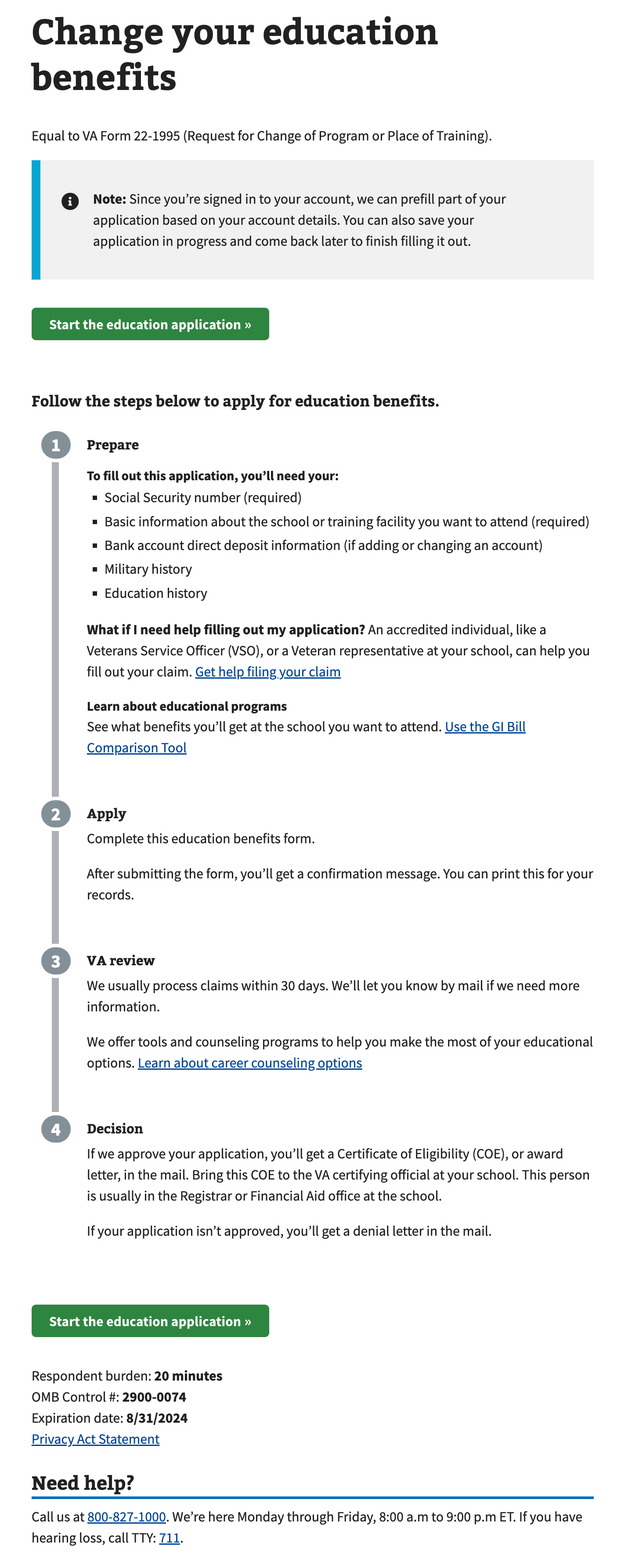
The Process list appears after a start form link on the form Introduction page. Additional calls-to-action to start the application or process that the process list describes can be found within (in the case of apply) and below the list.
Instances of this component in production

Content considerations
- List headings should start with a verb. Examples include “Prepare”, “Apply”, “Review”, etc.
- Make headings clear and concise. You can always write more content in paragraphs and other HTML elements below the heading.
- Make process step content clear and concise. Process list should not be a container for many other components and text. Use plain language and briefly explain the step in the process.
Accessibility considerations
Refer to the U.S. Web Design System for accessibility guidance
Additional accessibility considerations for VA
- Don’t use headings alone. Each step should have both a heading and content that helps describe the step in more detail.
Component checklist
Maturity
- Guidance
- Examples, usage, code usage, content considerations, and accessibility considerations are all complete.
- Research
- VFS team conducted research on this component which is linked from this page.
- Stability
- Component has been in production for more than 3 months with no significant issues found.
- Adoption
- Multiple teams have adopted this component.
Accessibility
While this component has been previously tested against older criteria, it has not yet been audited with the updated testing criteria.
Code assets
- Variations
- Storybook includes all variations (style, size, orientation, optional iconography, selection, error state, etc.)
- Responsive
- Component depicted in all responsive breakpoints.
- Interactive states
- Includes all interactive states that are applicable (hover, active, focus, keyboard focus, disabled).
- Tokens
- All design attributes (color, typography, layout, etc.) are available as tokens.
- Internationalization
- Describes i18n attributes.
Visual assets
- Variations
- Sketch library includes all variations (style, size, orientation, optional iconography, selection, error state, etc.)
- Responsive
- Component designed to work in all responsive breakpoints.
- Interactive states
- Includes all interactive states that are applicable (hover, active, focus, keyboard focus, disabled).
- Tokens
- All design attributes (color, typography, layout, etc.) are available as tokens.
Legend:
- Complete
- Incomplete
- Not applicable
 View va-process-list default in Storybook