Patterns
Ask users for…
Files
Also known as: File upload
Use: DeployedUsage
When to use this pattern
- Required documentation. When a user must upload a file in order to provide required documentation.
When not to use this pattern
- Don’t ask if it does not affect the delivery of a service. You should only ask users to upload documents if absolutely necessary.
Examples
Default
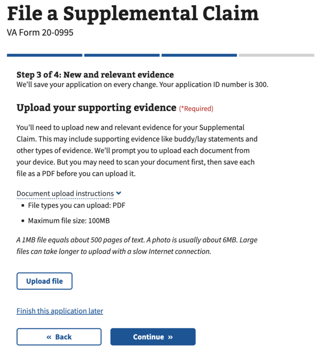
Loading
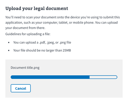
Review
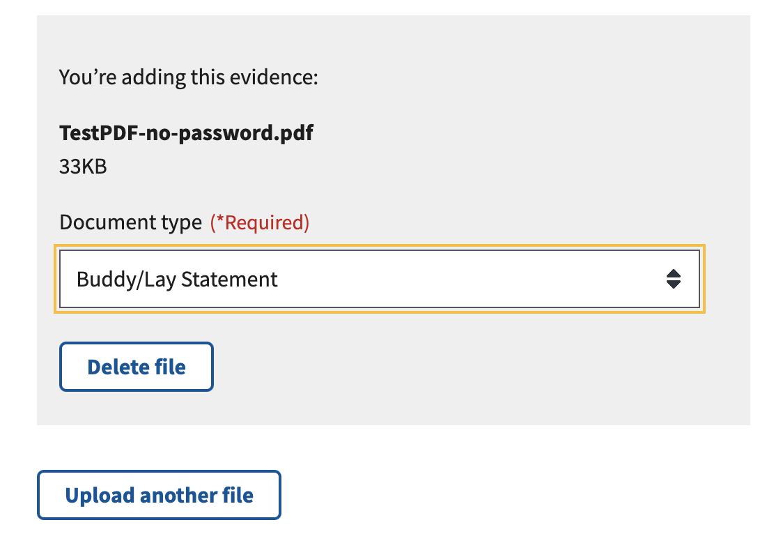
Review with PDF password option
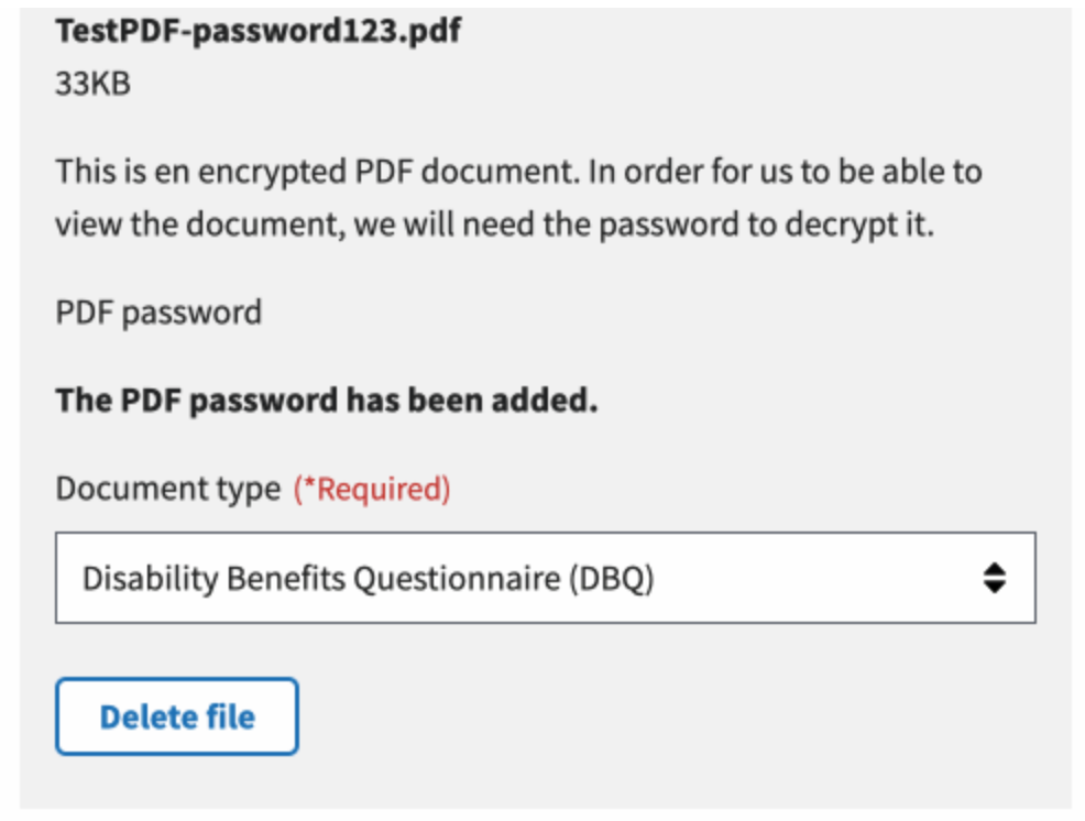
Delete
Examples in production
How to design and build
Layout details
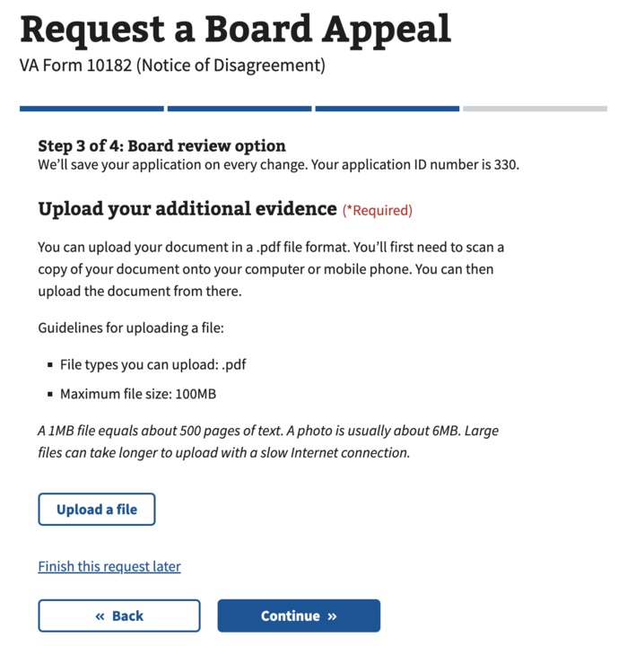
Use the File input component along with the following content placed above it:
- Header
- Instructions on what file(s) to upload
- Bullet list of allowed file types and sizes
Avoid allowing batch file uploads. Batch uploads are not mobile-friendly and can invite user and/or technical errors.
How this pattern works
Default
The File input component default state uses a secondary button and label placed in close proximity beneath the document upload instructions. When the user clicks the upload button a browser window will open to allow them to navigate to and select their file.
Loading
The upload button will be replaced by a gray card with the Progress bar - Activity component to indicate the progress of the document upload. The user will see the name of the file and have the option to cancel the upload.
Review
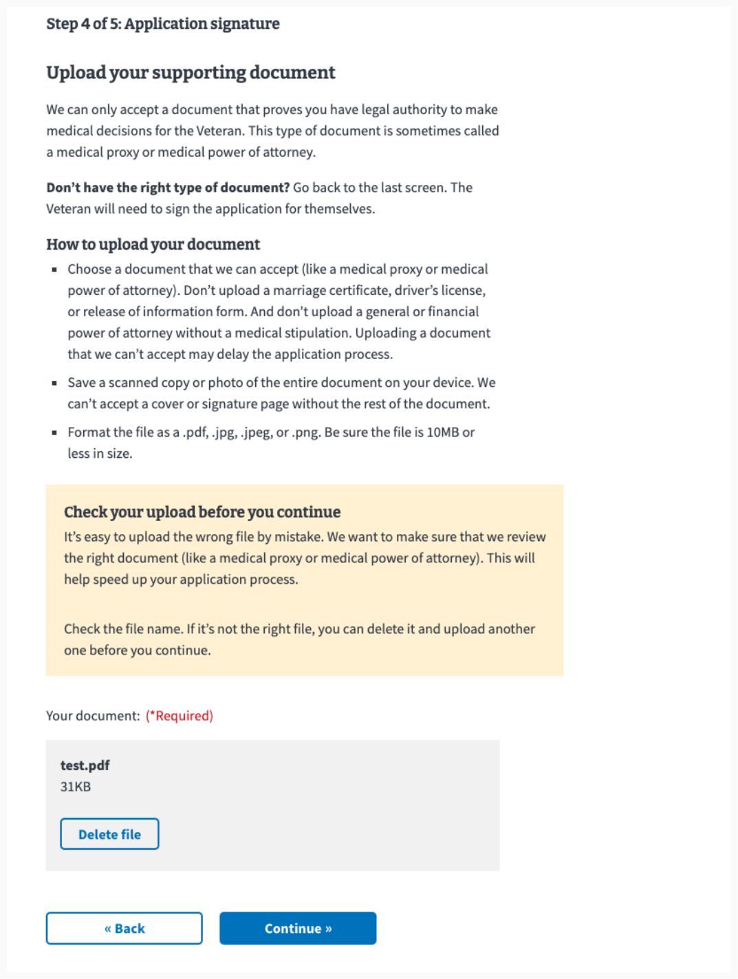
When a document has successfully uploaded, the card will display the uploaded file name in bold with an option to delete the file. Depending on the form, there may be a dropdown in the card to select the document type. If multiple files are allowed, the upload button will move beneath the card to give the user the option of adding more files one-by-one.
Delete
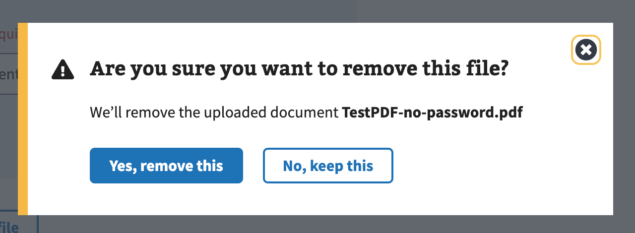
When a user triggers an action to remove or delete an upload file a modal confirming their action is presented. Within the modal the user can confirm and continue or cancel their action. This prevents accidental removal of the file which is an action that cannot otherwise be easily undone (the user would have to repeat the uplaod process).
Error
View va-file-input–error-message in Storybook
- Help prevent error states by listing the types and sizes of files allowed above the File input component. The allowed file types depend on the form, though most forms accept pdf, jpg, jpeg, and png.
- Validate file uploads and provide actionable error messages. Review feedback messages in the Messages dictionary for file upload success and error messages.
Content considerations
- Use explicit and specific words for actions. We prefer “upload” and “delete” as those words describe exactly what will happen when you tap or click.
- Upload instead of add. Use the word “Upload” instead of “Add”. For example, “Upload file” and “Upload another file”.
- Delete instead of remove. Use the word “Delete” instead of “Remove”. For example, “Delete file”. Also, do not use “Edit” unless the uploaded file can actually be edited in place. “Edit” is not appropriate for an uploaded file if the user has to delete and re-upload the file.
- Use file instead of document. File is the broadest term and thus preferable to “document” as that may be too specific when images, text files, and other file types may be acceptable for upload.
-
Follow messaging guidance. Follow the feedback messages in the messages dictionary for file upload success and failure.
- Consider the mobile experience. Avoid using words like “scan” or “convert” in the file upload instructions.
Accessibility considerations
- Do not italicize file type and size help text. Long strings of italicized text can be difficult to read for some users with low vision or reading disabilities.
- Ask for confirmation when deleting files. Destructive actions like deleting files should require two steps by users — the initial button click, and then a confirmation. This helps prevent users from accidentally deleting a file with an unintentional click, and provides an extra prompt for screen reader users and screen magnification users who might not see the visual change when a file is removed.
 View va-file-input–error-message in Storybook