Patterns
Wizard
Don't use: DeprecatedStatus
The Wizard pattern is now deprecated and replaced by the the help users complete a sub-task pattern.
You should not create any new instances of the Wizard pattern and should instead speak with the Design System Council or CollabCycle team who can direct you. You may attempt to retrofit an existing instance of the Wizard pattern until the help users to complete a sub-task pattern is more widely in use.
Purpose
- The VA.gov wizard pattern consists of a series of simple questions, written in plain language, used to glean a user’s specific eligibility status, background, or specific needs/goals.
- Wizards serve up one question at a time.
- Wizards use conditional logic, whereby the answer to the first question determines the next question to be asked, or answer options that should be made available.
- Wizards do not submit or store data.
Examples

-
Education Wizard: Find your benefits education form (code). You may need to scroll down to find the wizard. This wizard is used to help guide users to the correct education benefits form.
-
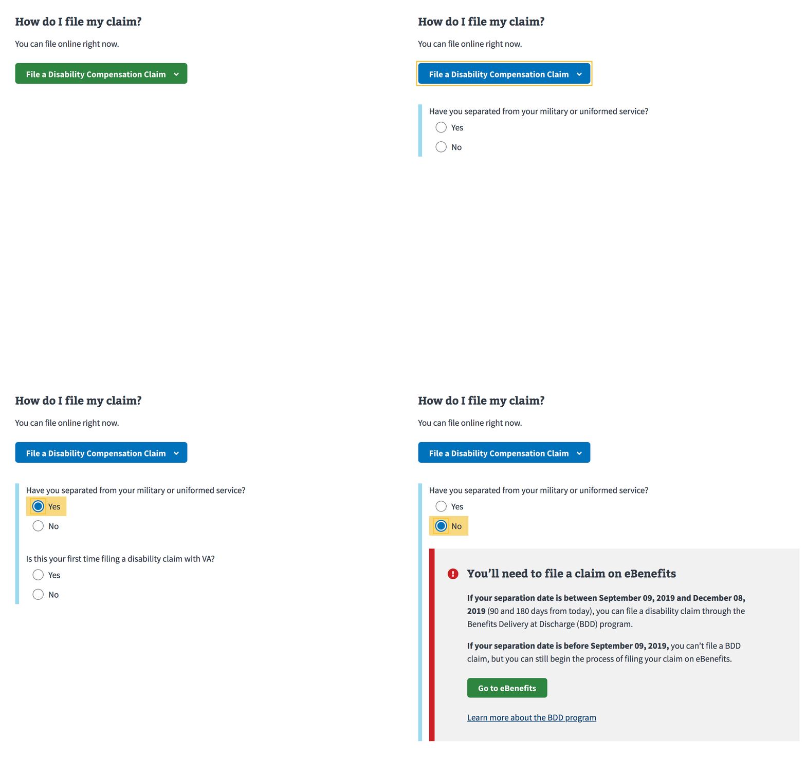
VA Disability Claim: How to file a VA disability claim (code). You may need to scroll down to find the wizard. This wizard is used to ensure that the right users are entering the disability claim application process at the right place. Some users, such as active duty service members, need to complete a different form on Benefits. Other users may need to complete an intent to file form before they can start the form on VA.gov. This wizard tries to divert users to the correct place.
-
Apply for service discharge upgrade: How to apply for a discharge upgrade (code). You may need to scroll down to find the wizard. Applying for a service discharge upgrade is a relatively new and very complex process. Depending on a user’s specific set of circumstances, they may need to complete different forms and send them to different places. This wizard is meant to collect information about those specific circumstances to give users the best available guidance of what they can do next. There are over 100 different combinations from the wizard that can yield different results, so it does not make sense to do a simple content page to explain eligibility.
This tool was developed prior to the Design System, so some of the patterns are not in alignment with other wizards. For example, the wizard starts at a new URL, does not use the blue sidebar, etc. However, this can be used as an example for similar use cases, where a very complex set of characteristics or circumstances may determine a user’s next step.
Where to place wizards
The wizard should live on the page on both the Eligibility and How to Apply pages for an application. The wizards begin under blue summary box eligibility boxes but before accordions or additional information.
Specifics of the pattern
-
Green “Start” Button: A wizard is launched through a primary button (green), with a clear label about what the wizard will help the user do, for example “Find your education benefits form”. A wizard may also END with a call-to-action, for example, “Apply now”; this button kicks off the next step, given the details that the user provided in the wizard. To distinguish between the call-to-action that starts the wizard and the call-to-action that takes the user to their next step and to set the hierarchy correctly when the sequence is complete, the first button changes from green to blue once clicked, and the final button becomes the green, primary call-to-action.
-
Questions: Questions appear one at a time under the button, using an expanding blue vertical left bar as new questions are added. Questions are conditional, based on previous answers. Structure the logic tree for wizard questions to get users to gather information from users in as few questions as possible, while still directing them to the best next step for their circumstances.
-
Warning alerts in the wizard. Show a warning alert if a user answers a question in a way that is uncommon, or if they need to first do some other process that cannot be accessed via the wizard. For example, in the Education Form wizard, Show the Warning Alert immediately after the question, and provide concrete next steps and directions.

-
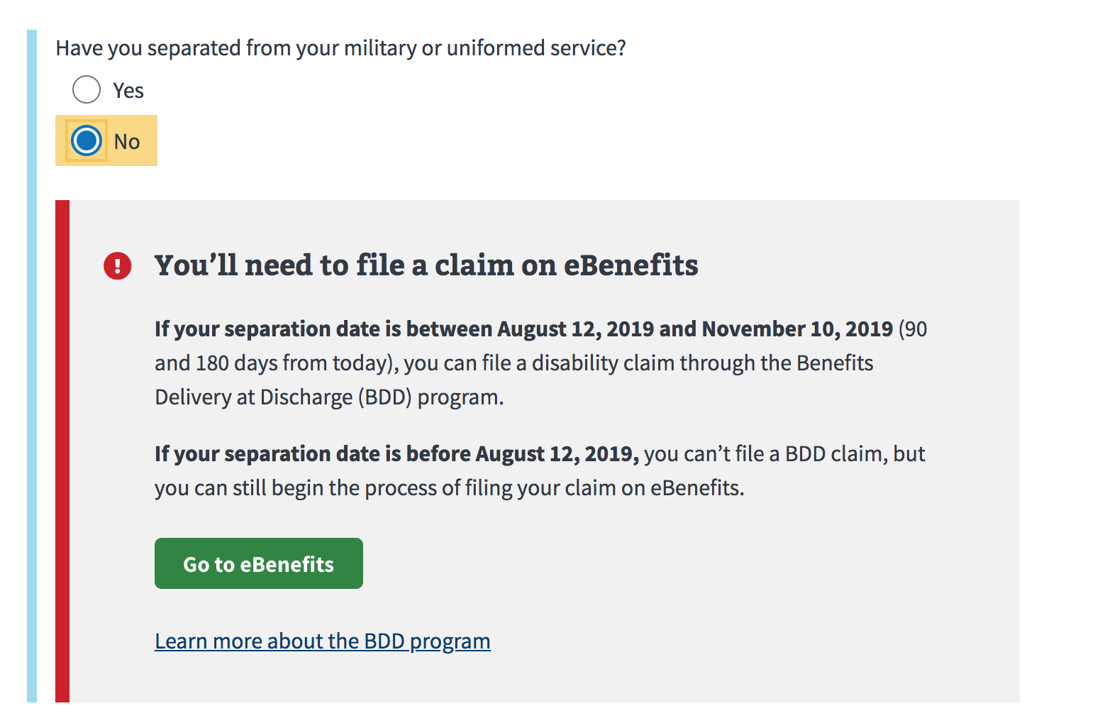
Error alerts in the wizard. Show an error alert if a user answers a question in a way that would render them ineligible to complete any of the forms serviced by the wizard. Instead, they may need to stop what they are doing and follow a different process on a different page or website. For example, in the Disability Claim wizard (shown below), a user who is still active duty needs to complete a completely different form on EBenefits, and completing an application on VA.gov would be a waste of time. Show the Error Alert immediately after the question, and provide concrete next steps and directions.

-
Editable answers: Users can scroll up to see all of their previous answers and make changes at any time. If a user makes a change to the answer to an earlier question, hide all previous answers and show only the next appropriate question in the series, based on the user’s answer.
Note: For both alert cases, a user can still change their answer in the wizard to access and complete the form. We do not block users from accessing a form completely based on their answers to the wizard questions because there is always an edge case. Theoretically, we want to make the BEST thing they can do the EASIEST thing to do, based on the information the user has provided. So, if we hypothesize that they are ineligible based on how they answered the wizard questions, we should be making the easiest next step to do the next best thing that they can do.

Research and Accessibility rationale
- We show questions one at a time for accessibility/universal design reasons: we try not to show irrelevant content to users.
- We learned through research to add blue left bar to show users that the wizard questions are related and part of the same process of finding the correct form.
- Wizard questions may come from user research, i.e. a point of confusion for many users regarding their eligibility for a VA benefit.
Retrofit this pattern
The Wizard pattern was deprecated primarily because of difficult-to-solve accessibility issues. However, many teams and products still rely on this pattern. While the Sub-task pattern is available, some teams may not be able to immediately adopt that new pattern and thus will need help minimizing the accessibility issues with this pattern:
Accessibility defects
- New inputs or conditional text added to the DOM based on user interaction with radio buttons, checkboxes, or select menus need to be announced to screen readers so users have context that new information is available.
- No clear end point.
- Easy for users to accidentally jump/tab out of the wizard.
- No clear and explicit validation of input.
- Nested fieldsets are problematic as the end of a fieldset is not announced by screen readers thus making it impossible for screen reader users to confidently know which fields belong within which fieldset.
- Providing results using dynamic show/hide behavior is spotty for screen reader users
New inputs or conditional text added to the DOM based on user interaction with radio buttons, checkboxes, or select menus can be confusing for screen reader users. They may miss that new information is added to the page after interacting with these elements. Why? Normally, screen reader users don’t get a notification with a radio button, checkbox, or select menu. This can create an experience where people may miss the context of why another question is being asked or why more content exists on the page.
Currently, the Wizard pattern allows this in multiple ways. To work around this, we recommend taking these steps to minimize possible issues with the screen reader experience.
What to do?
- Ask qualifying questions up front in the form, to avoid complicated branching logic and progressive disclosure patterns that reveal content inline whenever possible.
If you can’t avoid it:
- Keep new content added below the element that triggered the new content. This ensures that screen reader users who navigate down the page linearly won’t miss the newly added content.
- Keep the new content added simple. One additional question is okay. Or one additional input or clarifying sentence or two. However, the more that’s added may make it difficult for some screen reader users to understand how the new content is associated with what triggered it.
- Avoid inserting static content between interactive content. Screen reader users who navigate through forms may skip static content that is sandwiched between interactive content. Consider providing the new static content:
- On the following page
- Within an expandable additional info component (reachable by keyboard via the TAB key)
- As a polite aria live region
- Reach out for help. If an experience can’t avoid multiple instances of branching togic, or large amounts of newly added content, contact an accessibility specialist for help implementing ARIA live regions.