Patterns
Ask users for…
Feedback
Use: Deployed- Contributors
- Ian McCullough (VSP Contact Center)
Usage
When to use Feedback
- Always provide the ability for users to provide sentiment feedback. The feedback button appears at the bottom of every modernized VA.gov page.
Examples
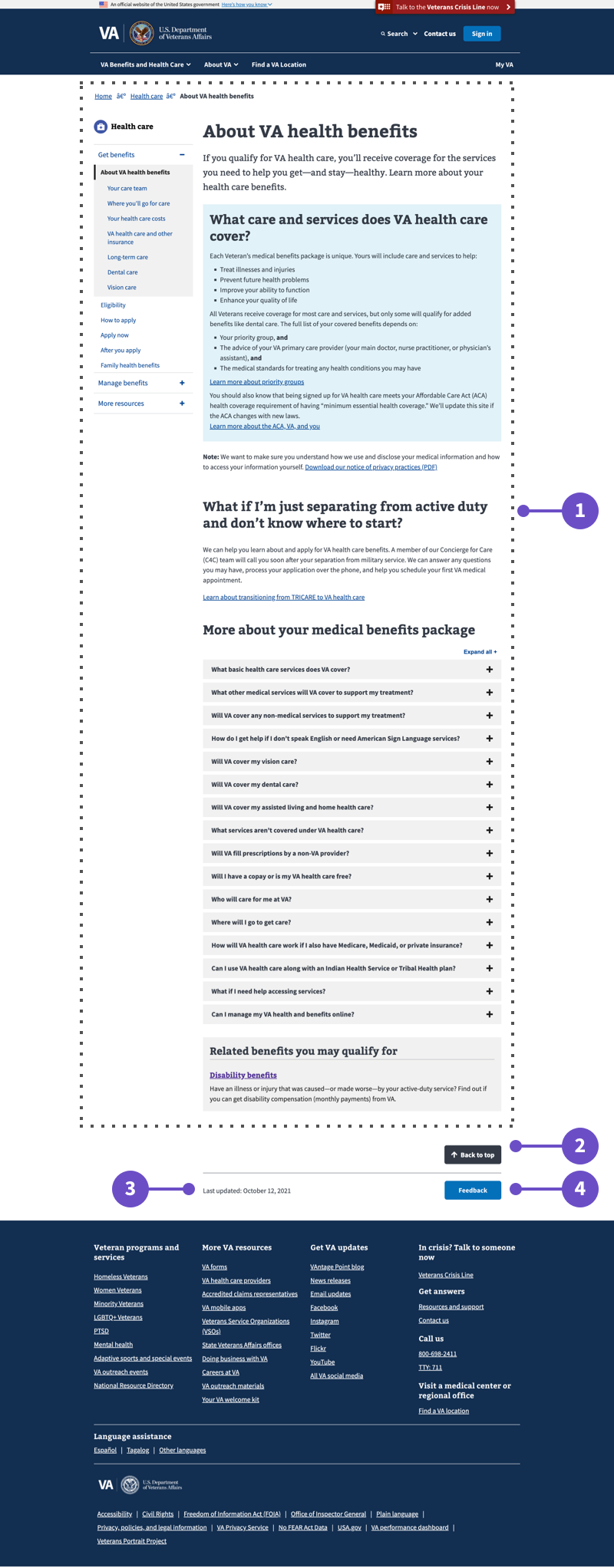
- Main Content. Content, including any left or right rail sections, within the main content of the page between the header and footer, but above the Back to Top/Last Updated/Feedback section.
- Back to Top Button. Button that scrolls the user back to the top of the page when clicked. This button does not appear on all VA.gov pages.
- Date updated. The date on which the page was most frequently updated. This text does not appear on all VA.gov pages.
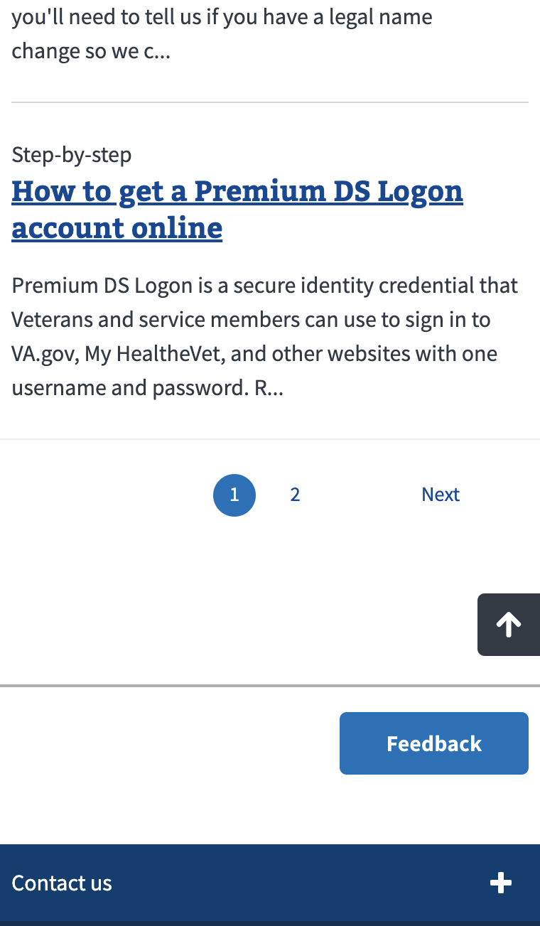
- Medallia Feedback Button. Button that launches a modal window that contains the Medallia feedback survey. This button does not appear on all VA.gov pages.
Examples in production
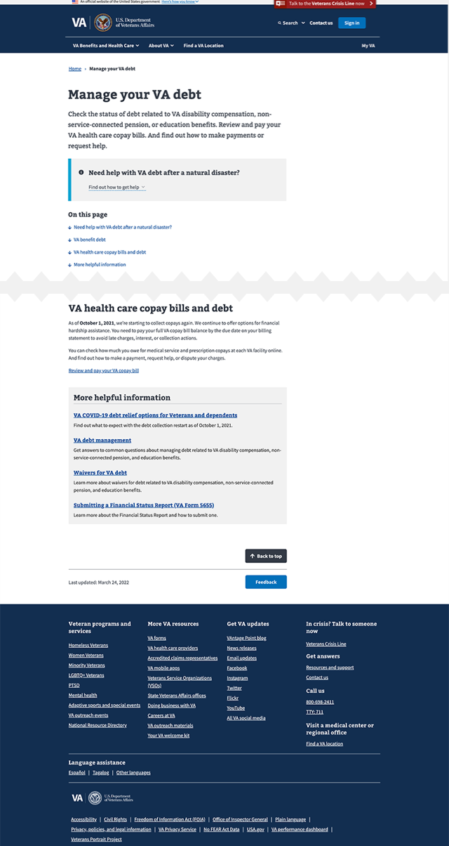
Desktop
Manage your VA debt – Desktop
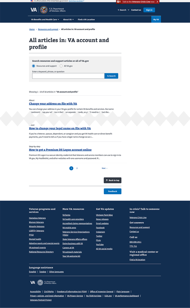
All articles in: VA account and profile – Desktop
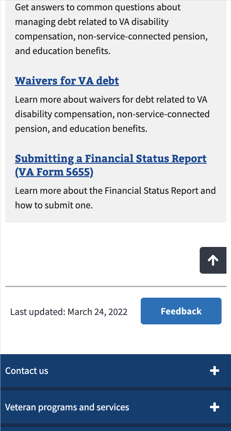
Mobile
Manage your VA debt – Mobile
All articles in: VA account and profile – Mobile
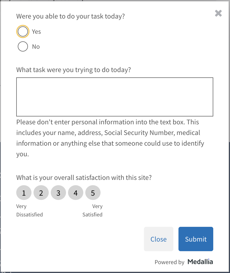
Feedback form in modal
How to design and build
Layout details
The Medallia Feedback button sits at the bottom of the main content within the context of other elements. In addition to the Feedback button, the bottom of the main content can also contain:
- Date last updated
- Back to top button
These three elements are not present on every page, and multiple variations can be found. For example, the articles search results page has the back to top and feedback buttons, but no ‘date last updated’ text. The signing in to VA.gov page has all three elements.
To better establish user expectations of location, appropriate space will be provided for an element regardless of it’s presence or absence. This creates a cohesive pattern that does not shift in size or location, even if one or two of the elements are not present on a particular page. The width of the pattern is also dynamically determined by the width of the main content container.
How this pattern works
- Users trigger the feedback interaction when clicking on the Feedback button.
- This opens a modal window that contains a form, shown above.
- After submitting the form the user sees a “Thank you” screen which can then be dismissed with a primary “Close” button. Focus is returned to the Feedback button.
Components used in this pattern
Accessibility considerations
Accessibility considerations are forthcoming.
Research
The previous location of the Medallia Feedback button was sticky on the right side of the browser window. This button had 508 accessibility issues on all platforms, and was removed from mobile due to display issues. By moving the button to the bottom of the main content, the accessibility issues were resolved and the button was able to be added to mobile breakpoints.
Usability Studies
Homepage redesign study
In the second round of usability testing for the new VA.gov homepage, 2 participants using ZoomText screen magification missed the feedback button. This is likely due to screen magnification showing only part of the screen at any given time. As there’s no indication that the feedback exists on the bottom right side of the page, it may be missed by magnification users who scan the page left to right with a limited view. An example is included in the report, “How disabled Veterans provide accessibility feedback.”
Foresee to Medallia usability studies
In late fall 2021, VA.gov transitioned from utilizing Foresee to Medallia to capture user feedback. This transition was accompanied by 2 usability testing sessions to test button location and button design. In both studies, the question “You would like to submit feedback on this Find VA Locations page on the VA.gov website. What would be your process for submitting that feedback?” was asked.
Study 1:
- 1 of 7 participants found the button in the sidebar.
- 5 of 7 participants looked in the footer.
Study 2:
- 6 of 11 participants found the button in the sidebar.
- 6 of 11 participants looked in the footer.
Note, in some instances during the second study, participants would look in the footer prior to finding the button in the sidebar.
Feedback Submission Comparison
To track the effectiveness of moving the feedback button to the bottom of the main content area, we compared the number of submissions on a single page before and after the button move.
| Page | Jan 1 - Jan 31 submissions | Feb 10 - Mar 12 submissions | % increase |
|---|---|---|---|
| Find locations | 92 | 247 | 168% |
| Schedule and manage health appointments | 32 | 74 | 131% |
| View disability rating | 19 | 35 | 84% |
| File for disability compensation with VA Form 21-526EZ Confirmation | 10 | 138 | 1280% |
| Check Your Post-9/11 GI Bill Benefits Status | 17 | 91 | 435% |
Both date ranges span 31 days, and the dates from January are submissions from the button on the sidebar. The February and March dates are submissions from the bottom of the main area (the button moved on Feb. 10).
Mobile feedback
In addition to the button being relocated on the desktop view, it was added to the mobile breakpoints as well. Previous 508 accessibility issues prevented the button from being displayed on the sidebar of mobile screens. From February 10 to March 12, there were 9,449 feedback submissions, 2,215 of which were mobile, or 23.4% of all submissions.