Components
List
Use: Best practiceExamples
Default
Simple unordered and ordered lists
- Unordered list item
- Unordered list item
- Unordered list item
- Ordered list item
- Ordered list item
- Ordered list item
- Definition list title one
- Definition list item
- Definition list item
- Definition list title two
- Definition list item
- Definition list item
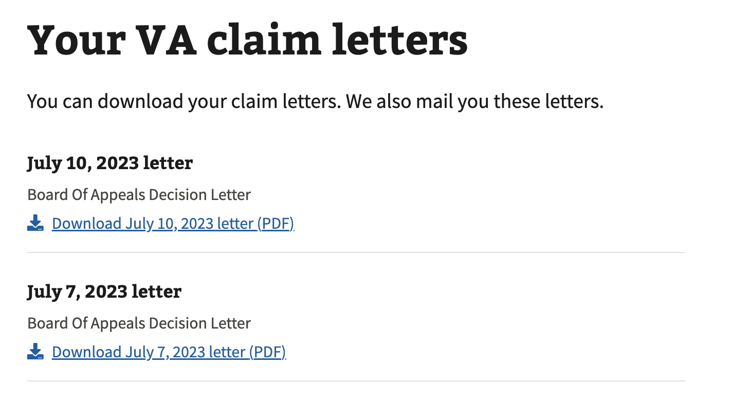
More complex unordered and ordered lists
-
July 10, 2023 letter
Board Of Appeals Decision Letter -
July 7, 2023 letter
Board Of Appeals Decision Letter
Usage
Refer to the U.S. Web Design System for usage guidance
Additional guidance for VA
How this component works
- Use square list-item-type for unordered lists. The square list item type is preferred.
- Two or more items. Lists with 2 or more items are acceptable.
Choosing between variations
- Use unordered lists when the order of the items is not relevant. List items in unordered lists can be in any order and are indicated with a black square.
- Use ordered lists for sequential information. Ordered lists are automatically enumerated by the browser.
- Use description lists for groups of related terms and descriptions. List items parts in definition lists will be connected programmatically.
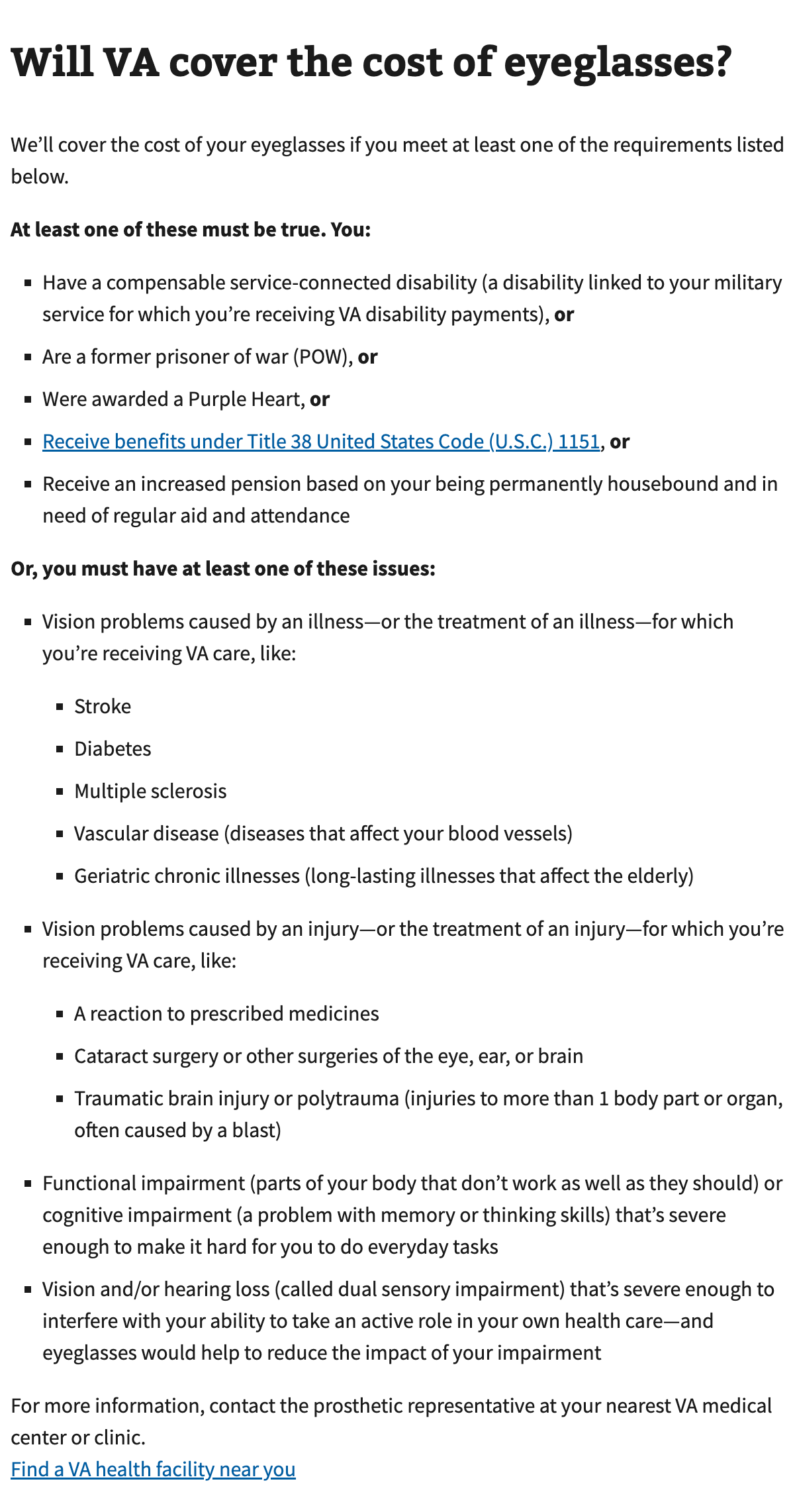
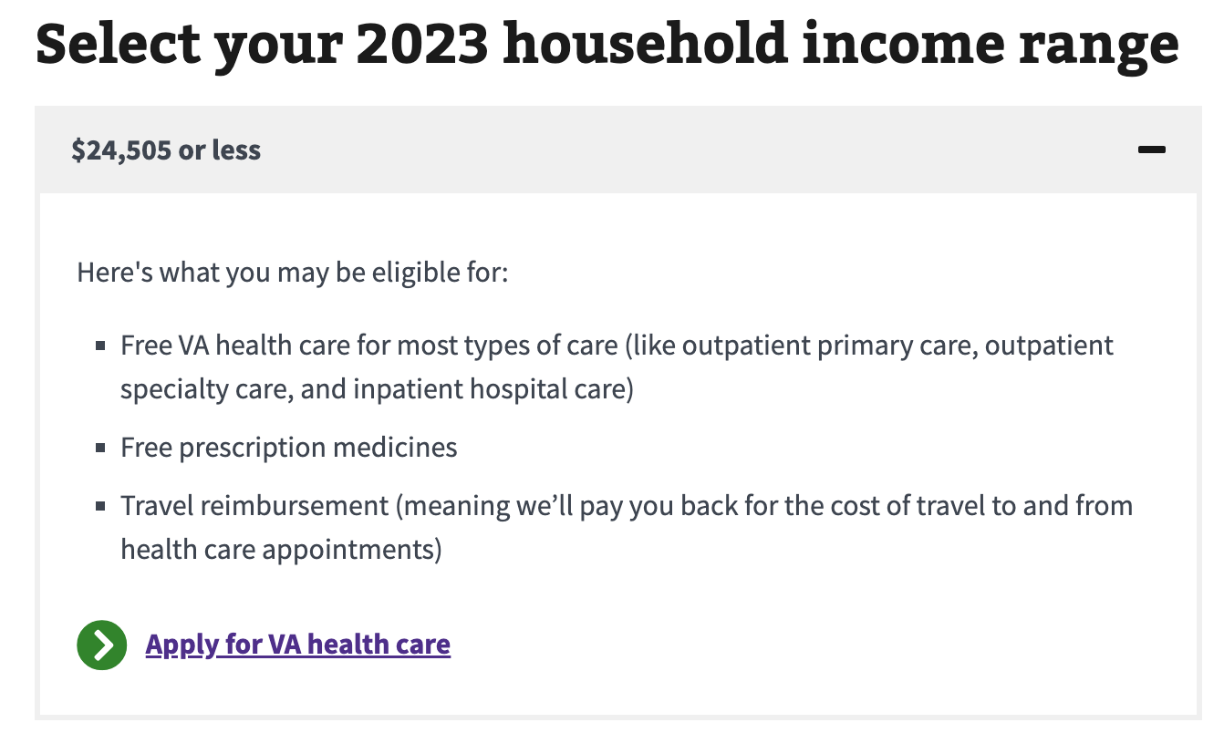
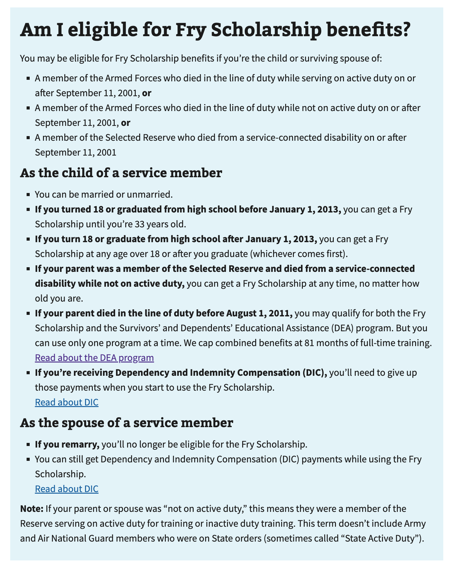
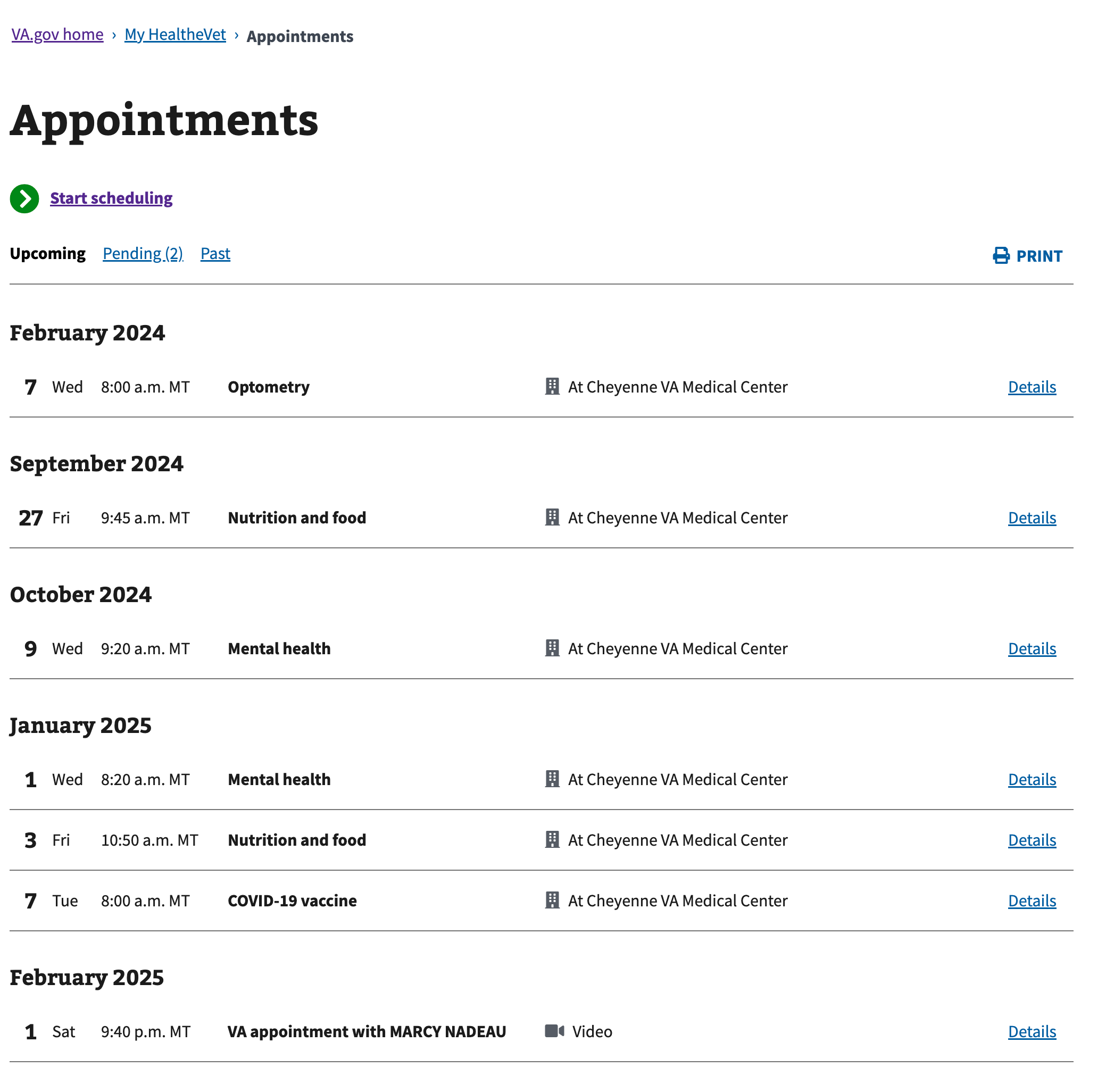
Instances of this component in production

Content considerations
- Introduce the list. Introduce the list with a full sentence.
- Capitalize the first word. Use sentence case and begin lists with a capital letter.
- No single item lists. Don’t use an ordered or unordered (bulleted) list for only one item.
- Item content must be succinct. Keep each item succinct for scannability (for example, 1 or 2 sentences each).
- Connect items appropriately. When using “and” or “or” at the end of each bullet point, use a comma and bold the “and”/”or” at the end of each bullet point.
- No more than 7 items without a break. If your list has more than 7 items, use subheads to break out the list into smaller bullet lists.
- Use parallel construction within a list. Each list item should be consistent. For example, starting with a verb or noun phrase.
Refer to the Content style guide for additional guidance for unordered lists
Accessibility considerations
- Unique headings and link text. For complex list items that are comprised of more than one line of content (e.g. header, description, link, etc.) ensure that any headings and link text within the list are unique.
- Under review: Unordered list items will read out as “black square”. We’re reviewing whether this potentially unexpected behavior is problematic for users of screen readers and may adjust the list item style type appropriately in future.
Related
Component checklist
Maturity
- Guidance
- Examples, usage, code usage, content considerations, and accessibility considerations are all complete.
- Research
- VFS team conducted research on this component which is linked from this page.
- Stability
- Component has been in production for more than 3 months with no significant issues found.
- Adoption
- Multiple teams have adopted this component.
Accessibility
While this component has been previously tested against older criteria, it has not yet been audited with the updated testing criteria.
Code assets
- Variations
- Storybook includes all variations (style, size, orientation, optional iconography, selection, error state, etc.)
- Responsive
- Component depicted in all responsive breakpoints.
- Interactive states
- Includes all interactive states that are applicable (hover, active, focus, keyboard focus, disabled).
- Tokens
- All design attributes (color, typography, layout, etc.) are available as tokens.
- Internationalization
- Describes i18n attributes.
Visual assets
- Variations
- Sketch library includes all variations (style, size, orientation, optional iconography, selection, error state, etc.)
- Responsive
- Component designed to work in all responsive breakpoints.
- Interactive states
- Includes all interactive states that are applicable (hover, active, focus, keyboard focus, disabled).
- Tokens
- All design attributes (color, typography, layout, etc.) are available as tokens.
Legend:
- Complete
- Incomplete
- Not applicable