Patterns
Ask users for…
Multiple responses
Also known as: List & Loop
Use: Deployed- Contributors
- Jeana Clark (Ad Hoc)
- Robert Hasselle (Oddball)
- Robin Garrison (Ad Hoc)
Usage
When to use this pattern
- Collecting the same data in a series of questions. Forms will often collect the same information about 1 or more items. For example, personal information about a Veteran’s dependents. The paper form equivalent would be a table where each row is an item and the columns are the questions.
- Collecting many possible responses. Some questions can have an unknown amount of answers, such as “list all the cities and states you’ve lived within.” This pattern appears in forms when we don’t know how many responses to a question a user will provide, but we need to collect a number between 1 and “n,” where “n” is all possible responses. This pattern appears in both simple and complex ways.
When not to use this pattern
- Collecting a single, or limited, response. For questions in a form that only have one answer, such as “What is the city and state of your birth?”, use the Ask users for a single response pattern.
- Inconsistent questions being asked for each item. If the same data isn’t being collected for each item then this pattern does not lend itself well as a solution as it is meant to capture the same set of information multiple times.
How to design and build - Multi-page
Use this pattern when users need to add similar information multiple times, such as information about dependents. This method allows more table-like data to be collected following the One thing per page principle.
When to use the multi-page variation
- This is the default and preferred variation for multiple responses. This method is the most flexible of the variations of obtaining multiple responses because it can collect just one or multiple pieces of information across multiple pages. Thus it can collect a very limited set of data or complex details.
When to not use multi-page
- Most of the information being requested is already available. If we have most of the information being requested already then the “Add item” variation is preferred. If the information we have on file is contact information coming from VA.gov Profile then the “Contact information” variation is preferred.
Required vs Optional multi-page patterns
There are two types of multiple page patterns with slightly different user flows:
- Required Multi-page Pattern
Use when at least one item for this step must be added. - Optional Multi-page Pattern
Use when the step is completely optional and users may or may not add items.
Required multi-page pattern user flow

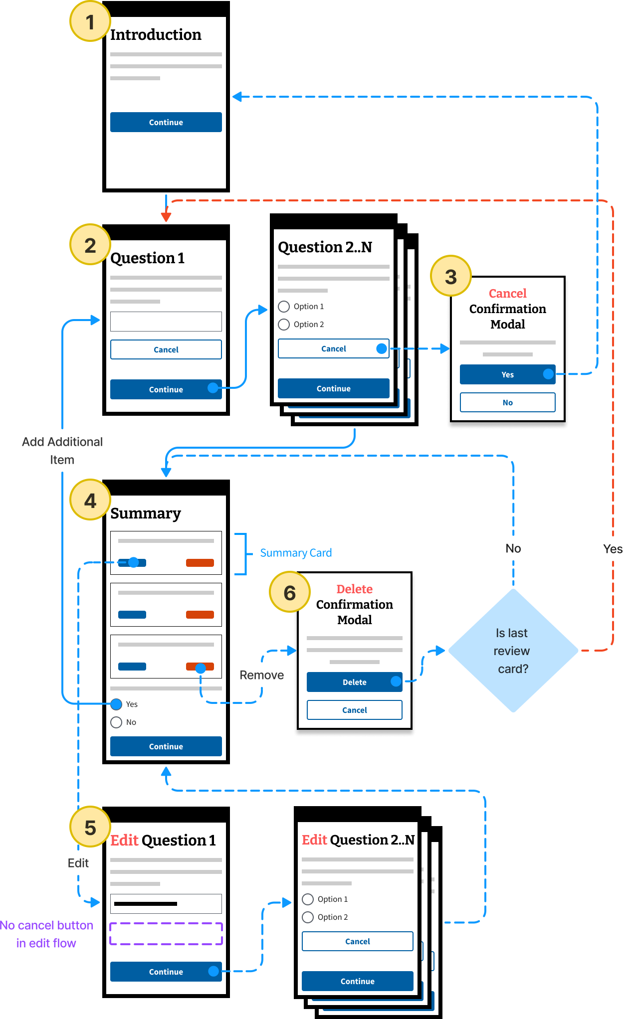
The introduction page provides users with information about the next few screens. If there’s a limit to the maximum number of items, see the code & content considerations to customize the language.
The user proceeds into the questions flow. We recommend following the One thing per page pattern.
At any time in the questions flow a user can exit by clicking the Cancel adding this [thing] button. A modal appears to confirm their choice. If they confirm, any data they have entered is removed, and the user is returned to the Introduction page.
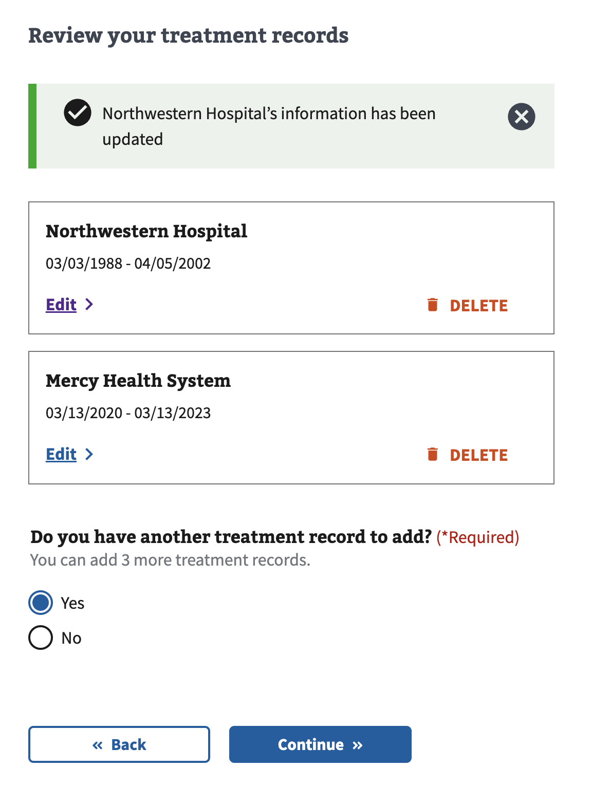
A summary page allows users to review what they’ve entered formatted as summary cards. If the user chooses to add another item, they return to the first question page to add the new item.
Clicking Edit puts the user into the “edit flow” and returns the user to the first question page. When entering the edit flow, the H3 of the pages are updated to include “Edit [previous h3 title]”. The fields should pre-populated with their previously supplied information. (Note: There is no Cancel button on this page during the editing process.) After editing items, the user returns to the summary page and an informational alert is shown confirming their item has been updated.
A user may choose to delete any of the summary cards. When clicking Delete, a modal appears asking them to confirm their choice. If they confirm, that card is removed from the page. If all cards are removed from the summary page, the user will then redirect to the Introduction page with a warning alert reminding the user at least one item is required.
Optional multi-page pattern user flow

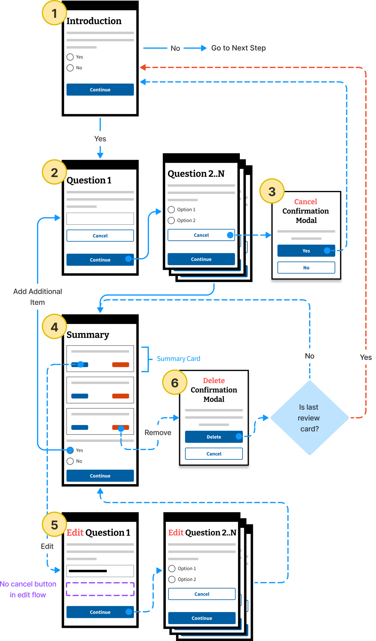
The introduction page provides users with information about the next few screens and provides a Yes/No choice to provide additional information. If the user selects Yes they will proceed into the questions flow. If the user selects No, they proceed to the next step.
The user proceeds into the questions flow. We recommend following the One thing per page pattern.
At any time in the questions flow a user can exit by clicking the Cancel adding this [thing] button. A modal appears to confirm their choice. If they confirm, any data they have entered is removed, and the user is returned to the Introduction page.
A summary page allows users to review what they’ve entered formatted as summary cards. If the user chooses to add another item, they return to the first question page to add the new item.
Clicking Edit puts the user into the “edit flow” and returns the user to the first question page. When entering the edit flow, the H3 of the pages are updated to include “Edit [previous h3 title]”. The fields should pre-populated with their previously supplied information. (Note: There is no Cancel button on this page during the editing process.) After editing items, the user returns to the summary page and an informational alert is shown confirming their item has been updated.
A user may choose to delete any of the summary cards. When clicking Delete, a modal appears asking them to confirm their choice. If they confirm, that card is removed from the page. If all cards are removed from the summary page, the user is redirected to the Introduction page.
Code & content considerations
- Use the built in error and validation messages.
- Successful editing of an item
- Successful removal of an item
- When the maximum number of items have been added
- When all items in a required loop have been removed
- When a user wants to cancel adding an item mid-flow
- Use the built in functionality for using the same word for adding an item on question pages, summary cards, and edit pages. For example:
- Do you want to add another [dependent]?
- Review your [dependents]
- Remove a [dependent]
- You have added the maximum number of [dependents]
- If at least one item is required, use hint text to let users know. The pattern must indicate to users that at least one item is required. If all items are removed, return users to the first page of the loop to gather information.
- If there are a maximum number of items, make this clear to the user. You can use hint text to do this. Also, after the user has entered the maximum number allowed the pattern removes the “add another” question, and displays a warning instructing the user that they have entered the maximum allowed and they can either edit, or remove a card if they need to add more information.
For more details
Accessibility considerations
On the summary page, ensure that the edit links and delete buttons have accessible text so that screen reader users understand what is being edited or deleted.
Examples in Production

How to design and build - Add item
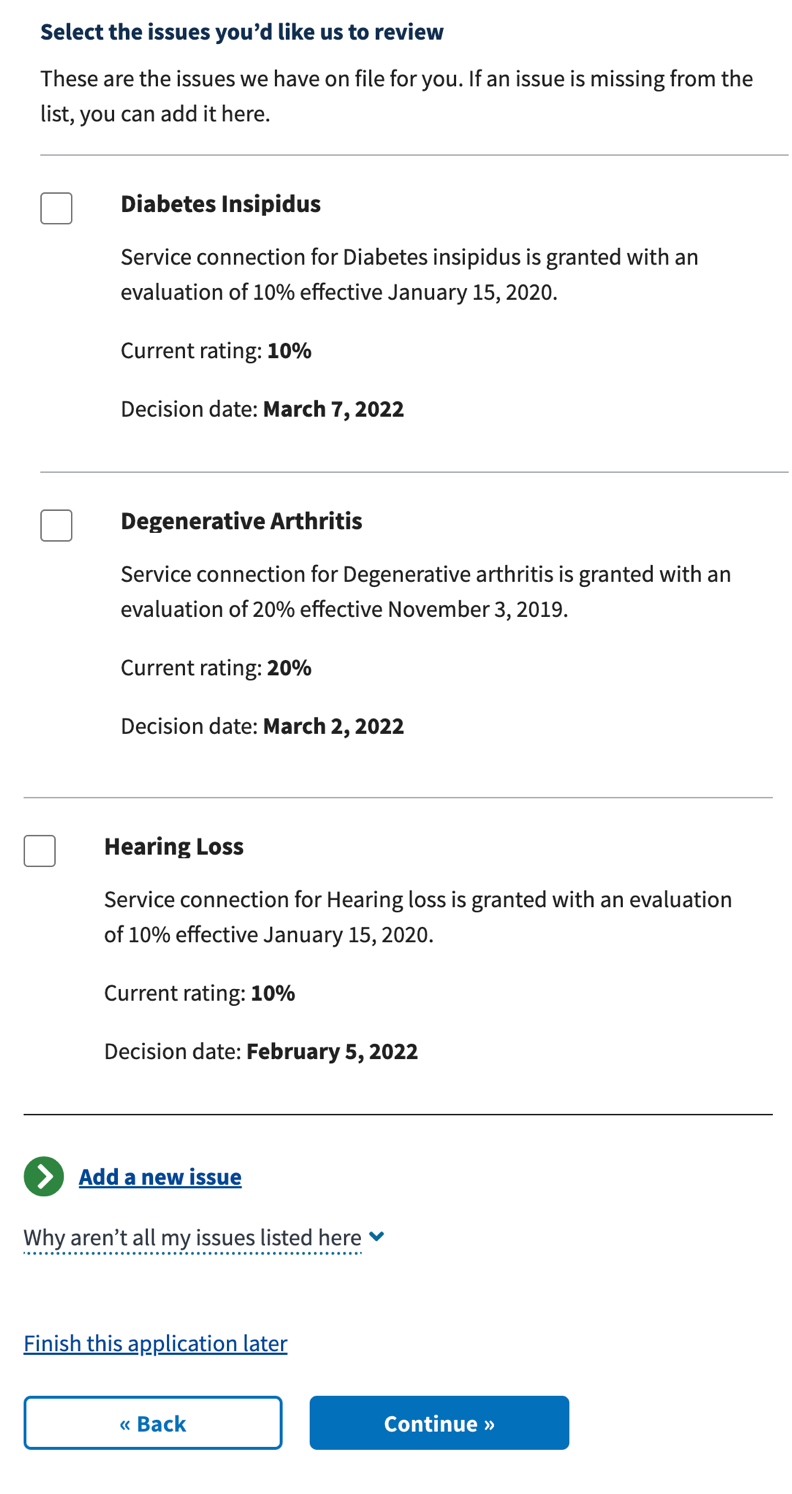
This method shows all items on one page in a list with an “Add a new [item]” Link - Action (primary) at the bottom of the list that navigates the user to a new page to add the item.

- Items are displayed in a list with checkboxes for selecting items.
- The “Add a new [item]” is displayed using the Link - Action (primary) component.
- The “Add a new [item]” link directs the user to a new page with the form elements for adding an item.
- Upon completion, a “add” or “update” button returns the user to the original page with the new item added. A “Cancel” button returns the user to the original page without any changes.
Code considerations
How to use “Add item” link in Array Data details how to implement this variation.
When to use the add item variation
- Most of the information being requested is already available. If most of the information being requested is already on file then this variation works well because it presents to the user what we have on file and allows them to add items that are missing.
- Information on file is not contact information coming from VA.gov Profile. If the information on file is not coming from VA.gov Profile then this variation presents the data clearly and is preferred. If the information on file IS coming from VA.gov Profile then the “Contact information” variation is preferred.
About single page usage
While the single-page variation is currently used on VA.gov, it is no longer the preferred variation for this pattern. The multi-page pattern is recommended for new designs.