Patterns
Help users to…
Check eligibility
Use: Deployed
Follow this pattern to help users to check their eligibility for a benefit or service.
Usage
When to use this pattern
- When a user may not be eligible for a benefit or service. Providing users feedback on their eligibility for a benefit or service, and enabling a way to change their answers, can help reduce a high rate of declined applications.
Design principles
- Presenting users feedback on their eligibility gives them the control and freedom to exit what may be a lengthy process and provides a way to correct a mistake early in the process.
- This pattern may also be thought of as an example of introducing useful friction in the process by anticipating possible errors that would cause an application to be rejected.
When not to use this pattern
- As a panacea for removing friction and complexity. Work must still be done to make eligibility criteria clear and understandable to applicants for a service or benefit. This includes, at minimum, writing the eligibility criteria in plain language and testing that content with users, then iterating on the design based on their feedback. This pattern attempts to make complicated requirements clearer to end users but it is neither an excuse nor salve for overly complex or confusing requirements.
Examples
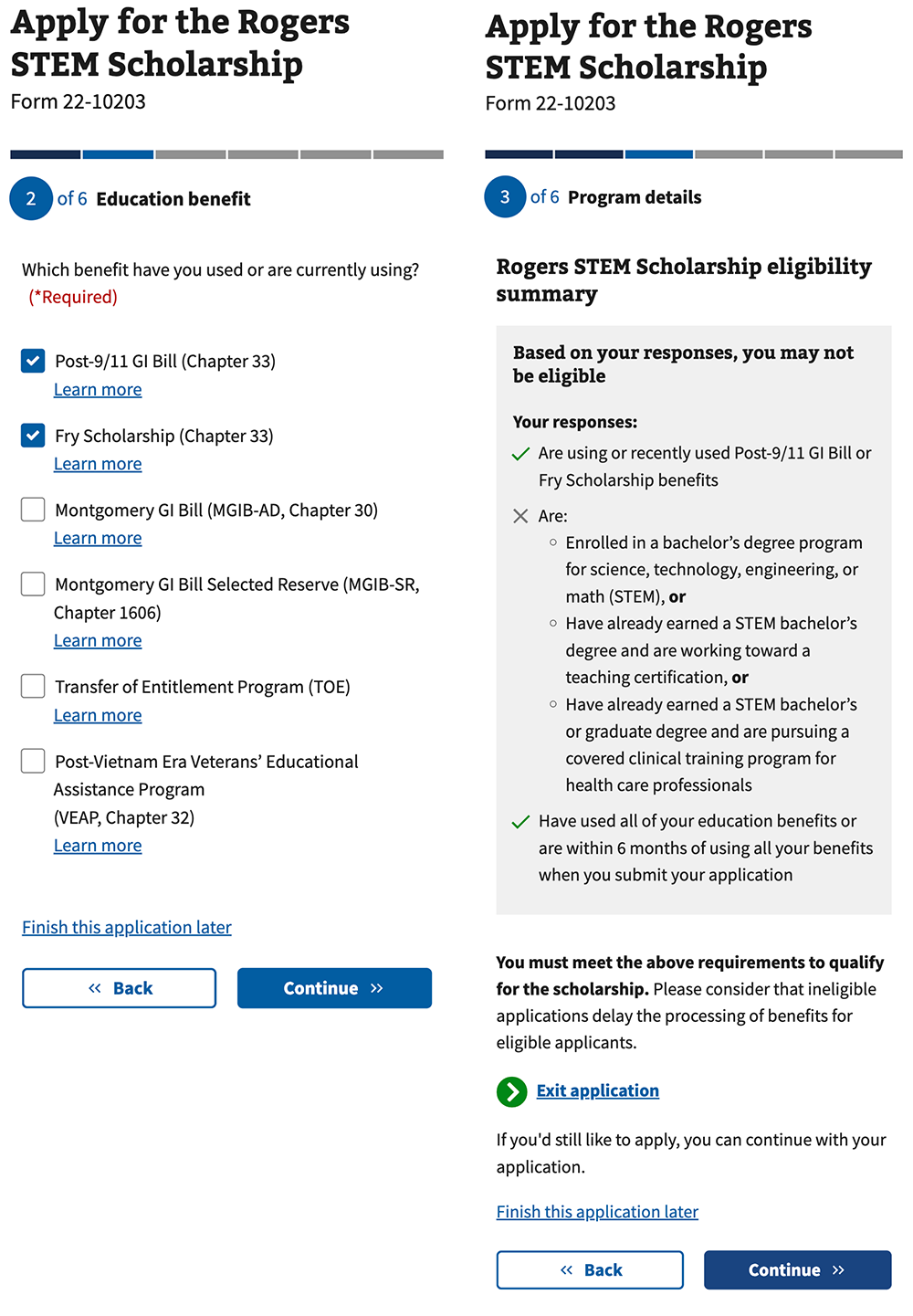
Apply to Rogers STEM scholarship

How to design and build
How this pattern works
- Alert the user if they do not meet the eligibility requirements for the benefit or service and provide an exit. On step 2 of the application process above the user is warned that based on their responses they may not be eligible. There is an option to exit the application, finish the application later, or to continue. (NOTE: The green “Exit application” button is deprecated and would today be secondary button or action link).
- Provide a clear summary of eligibility requirements met and not met. This provides the user a clear account of which eligibility requirements they have, and have not, met so that they can adjust their answers if they believe the system’s assertion to be incorrect, or continue with their application with the knowledge that they may not be eligible. There is no need to continuously repeat this summary or message and doing so may prove tedious to users who do want to continue.