Components
File input
Use with caution: Available USWDS v3
This guidance covers two web components:
- Use the File input variation for uploads that accept a single file.
- Use the File input multiple variation for uploads that accept multiple files.
Examples
NOTE: Storybook does not allow for showing components in a particular state. Thus some of the examples in this component are screenshots rather than Storybook examples. You will find the Storybook examples in Storybook but will have to manually upload files in order to reproduce the appropriate variation state.
Default - Single file
View va-file-input in Storybook
Default - Single file - Populated
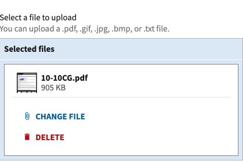
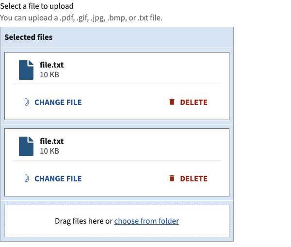
Default - Multiple files - Populated singular
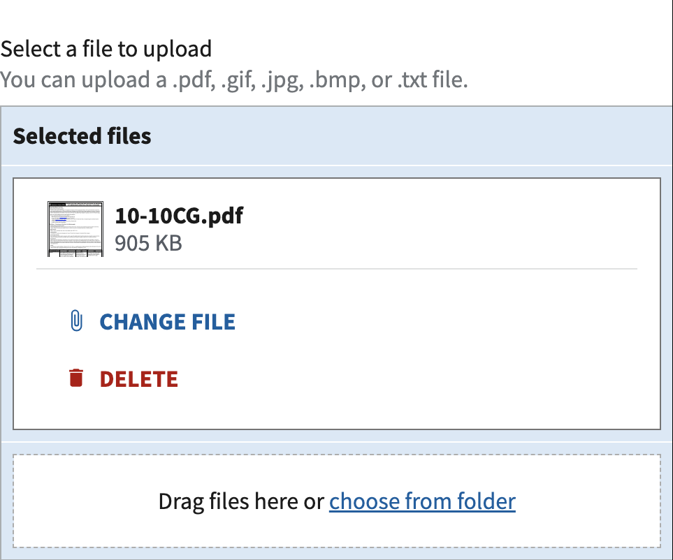
Default - Multiple files - Populated multiple
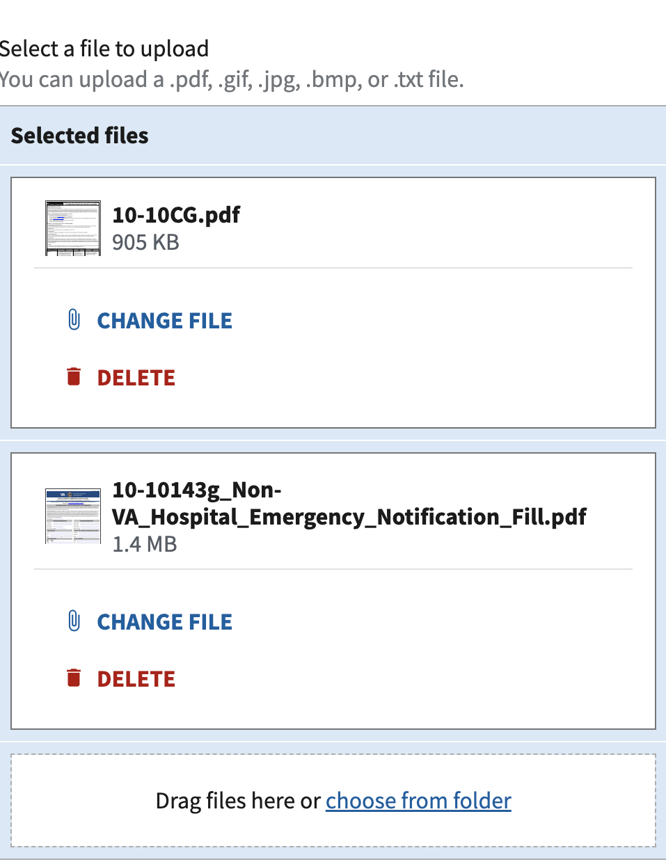
Required
View va-file-input when required in Storybook
Accepts only specific file types
View va-file-input that accepts only specific file types in Storybook
Accepts any kind of image
View va-file-input that accepts any kind of image in Storybook
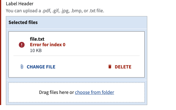
Error Message
NOTE: Storybook does not allow for showing components in a particular state. Thus some of the examples in this component are screenshots rather than Storybook examples.
Single file error
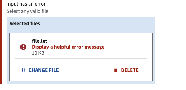
Multiple file error
Header label
Change the label to any H1 through H6 header size.
View va-file-input header label in Storybook
Additional form inputs
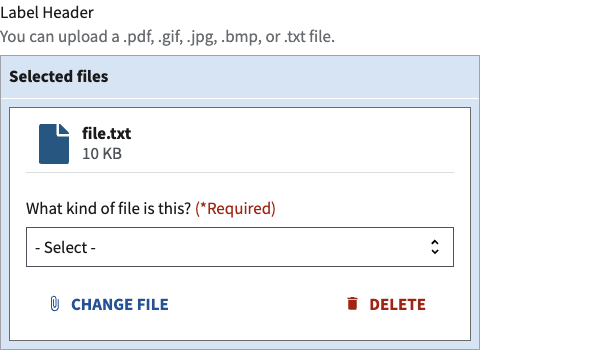
Multiple files
Usage
Refer to the U.S. Web Design System for usage guidance
Additional guidance for VA
- One file per input. The file input supports uploading a single file multiple times, but does not support selecting multiple files at a single time. This component only supports one file upload at a time. The reason for this is some users might not know how to select multiple files in a file browser. Additionally, iOS does not allow multiple-file selection using the Files app. Thus, the VA implementation of this component does not deviate from our current pattern for handling multiple file uploads by prompting for each file with a new file input component.
- Files pattern guidance. Follow the files pattern guidance for how to include the file input in a form.
How this component works
- Pair with a label. Be sure to provide label text with the file input component.
- Highlight input restrictions. Use hint-text to be clear about any file restrictions, such as file types or maximum size.
Behavior
- Trigger: The file input button triggers a micro-interaction that causes the Operating System (OS) to present a dialog that prompts the user to select a file to upload.
- Rules: Once the file is uploaded, the browser presents a dialog to inform the user of the success or failure of the upload. The uploaded file can then be removed by the user, if necessary. Additional files can be uploaded, one by one.
- Feedback: The Progress bar - Activity component should be used to provide feedback to the user while the file is uploading if the upload is happening to the server on the current step. The Progress bar is not necessary if the upload of the file happens upon page submit or at a later point in the process. The Progress bar is currently not a feature of the file input component and will be added at a later date.
Errors
- When using a single file input the error message is placed above the file input area. If the file input supports multiple files then the error message is placed within the file input card.
- To display a custom error message, pass text into the
errorproperty.
View form error handling for additional guidance
Code usage
Attributes and Properties
| Property | Attribute | Type | Default | Description |
|---|---|---|---|---|
accept |
accept |
string |
A comma-separated list of unique file type specifiers. | |
buttonText |
button-text |
string |
The text displayed on the button. | |
enableAnalytics |
enable-analytics |
boolean |
false |
Emit component-library-analytics events on the file input change event. |
error |
error |
string |
The error message to render. | |
headerSize |
header-size |
number |
Optionally specifies the size of the header element to use instead of the base label. Accepts a number from 1 to 6, corresponding to HTML header elements h1 through h6. If not provided, defaults to standard label styling. | |
headless |
headless |
boolean |
false |
DST only prop removes extraneous display for multiple file input |
hint |
hint |
string |
Optional hint text. | |
label |
label |
string |
The label for the file input. | |
name |
name |
string |
The name for the input element. | |
required |
required |
boolean |
false |
Sets the input to required and renders the (*Required) text. |
Events
| Name | Description |
|---|---|
component-library-analytics |
The event used to track usage of the component. This is emitted when the file input changes and enableAnalytics is true. |
vaChange |
The event emitted when the file input value changes. |
Content considerations
- Use explicit and specific words for actions. We prefer “upload” and “delete” as those words describe exactly what will happen when you tap or click.
- Upload instead of add. Use the word “Upload” instead of “Add”. For example, “Upload file” and “Upload another file”.
- Delete instead of remove. Use the word “Delete” instead of “Remove”. For example, “Delete file”. Also, do not use “Edit” unless the uploaded file can actually be edited in place. “Edit” is not appropriate for an uploaded file if the user has to delete and re-upload the file.
- Use file instead of document. File is the broadest term and thus preferable to “document” as that may be too specific when images, text files, and other file types may be acceptable for upload.
- Follow messaging guidance. Follow the feedback messages in the messages dictionary for file upload success and failure.
Accessibility considerations
Refer to the U.S. Web Design System for accessibility guidance
Component checklist
Maturity
- Guidance
- Examples, usage, code usage, content considerations, and accessibility considerations are all complete.
- Research
- VFS team conducted research on this component which is linked from this page.
- Stability
- Component has been in production for more than 3 months with no significant issues found.
- Note: This component was converted from React to a web-component in August 2022.
- Adoption
- Multiple teams have adopted this component.
Accessibility
While this component has been previously tested against older criteria, it has not yet been audited with the updated testing criteria.
Code assets
- Variations
- Storybook includes all variations (style, size, orientation, optional iconography, selection, error state, etc.)
- Responsive
- Component depicted in all responsive breakpoints.
- Interactive states
- Includes all interactive states that are applicable (hover, active, focus, keyboard focus, disabled).
- Tokens
- All design attributes (color, typography, layout, etc.) are available as tokens.
- Internationalization
- Describes i18n attributes.
Visual assets
- Variations
- Sketch library includes all variations (style, size, orientation, optional iconography, selection, error state, etc.)
- Responsive
- Component designed to work in all responsive breakpoints.
- Interactive states
- Includes all interactive states that are applicable (hover, active, focus, keyboard focus, disabled).
- Tokens
- All design attributes (color, typography, layout, etc.) are available as tokens.
Legend:
- Complete
- Incomplete
- Not applicable
 View va-file-input in Storybook