Components
Checkbox
Use: Deployed English, Spanish, Tagalog USWDS v3
Examples - Single
Default
Tile
View va-checkbox tile in Storybook
Checked
View va-checkbox checked in Storybook
Hint text
View va-checkbox with hint text in Storybook
Description String
View va-checkbox with description string in Storybook
Description JSX
View va-checkbox with description JSX in Storybook
On background
View va-checkbox on a background in Storybook
Error
View va-checkbox error in Storybook
Required
View va-checkbox required in Storybook
Internationalization
View va-checkbox internationalization in Storybook
Examples - Group
Default
View va-checkbox-group default in Storybook
Label header
View va-checkbox group label header in Storybook
Hint text
View va-checkbox group with hint text in Storybook
Required
View va-checkbox group required in Storybook
Single checkbox
View va-checkbox group single checkbox in Storybook
Tile
View va-checkbox group tile in Storybook
Forms pattern - Single
View va-checkbox group forms pattern single in Storybook
Forms pattern - Single error
View va-checkbox group forms pattern single error in Storybook
Forms pattern - Multiple
View va-checkbox group forms pattern multiple in Storybook
Error
View va-checkbox group error in Storybook
Internationalization
View va-checkbox group internationalization in Storybook
Usage
Refer to the U.S. Web Design System for usage guidance
Additional guidance for VA
When to consider something else
- If there are too many options to display on a mobile screen.
- If a user can only select one option from a list (use radio buttons instead).
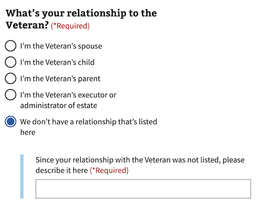
Conditionally revealed fields
In the radio button and checkbox components, we offer an option to conditionally reveal fields when the user selects an answer. These fields are often used to group related questions together by revealing a single follow-up question only when they’re relevant to the user.
Conditionally revealed fields can be used if the following conditions are met:
- There should only be one reveal on a page.
- When the revealed trigger is selected, you must be able to tab directly into the newly revealed field (Which is why we’ve put the “other” question last.)
- The newly revealed question field must be understood by itself. For example, don’t just say “Other”. Instead, say:
Since your relationship with the veteran was not listed, please describe it here

Errors
- Refer to the specific error examples above.
View form error handling for additional guidance
Hint text
- Refer to the hint text example above.
View label hint text for additional guidance
Code usage
Attributes and Properties
| Property | Attribute | Type | Default | Description |
|---|---|---|---|---|
enableAnalytics |
enable-analytics |
boolean |
false |
Whether or not an analytics event will be fired. |
error |
error |
string |
A string with an error message. | |
formHeading |
form-heading |
string |
The content of the heading if `useFormsPattern` is true. | |
formHeadingLevel |
form-heading-level |
number |
3 |
The heading level for the heading if `useFormsPattern` is true. |
hint |
hint |
string |
Optional hint text. | |
label |
label |
string |
The text label for the checkbox group. | |
labelHeaderLevel |
label-header-level |
string |
Insert a header with defined level inside the label (legend) | |
messageAriaDescribedby |
message-aria-describedby |
string |
An optional message that will be read by screen readers when a checkbox is focused. | |
required |
required |
boolean |
false |
Whether or not this input field is required. |
useFormsPattern |
use-forms-pattern |
string |
Enabling this will add a heading and description for integrating into the forms pattern. Accepts `single` or `multiple` to indicate if the form is a single input or will have multiple inputs. |
Events
| Name | Description |
|---|---|
component-library-analytics |
The event used to track usage of the component. This is emitted when an input value changes and enableAnalytics is true. |
vaChange |
The event emitted when the input value changes. |
Using message-aria-describedby
In HTML, the attribute aria-describedby accepts ids of the elements that describe an object. This is used to establish a relationship between an element and text elsewhere that describes it for screen readers.
However, the VA.gov Design System uses web components and the shadow DOM, which prevents HTML’s aria-describedby from being able to establish the relationship between elements. Because of that, the message-aria-describedby prop is used in our components instead. Instead of accepting ids, it accepts a message string to read out. This message is placed inside the shadow DOM, hidden visually, but made accessible to screen readers. This allows it to function similarly to aria-describedby and have the descriptive text read out when the element is focused.
Native Events
The native onBlur event is available on this component. It can be used by adding the event handler to your component and it will then listen to the event and respond accordingly when the event fires.
Content considerations
Refer to our bulleted list guidance for punctuation and general considerations
Accessibility considerations
Refer to the U.S. Web Design System for accessibility guidance
 View va-checkbox in Storybook