Components
Summary box
Also known as: Featured content
Use: Deployed USWDS v3
Examples
Default
View va-summary-box in Storybook
Usage
Refer to the U.S. Web Design System for usage guidance
Additional guidance for VA
When to use summary box
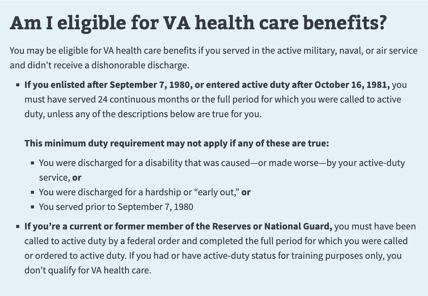
- Highlight the most important information. The Summary box component is for calling out key details that readers shouldn’t miss. It was originally intended to hold eligibility data exclusively. The content should be “evergreen”, not time sensitive.
When to consider something else
- Basic overview information. This component is not intended for basic overview information.
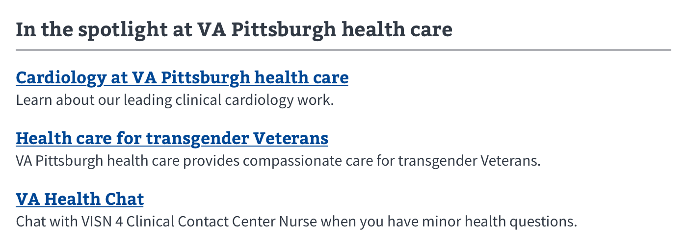
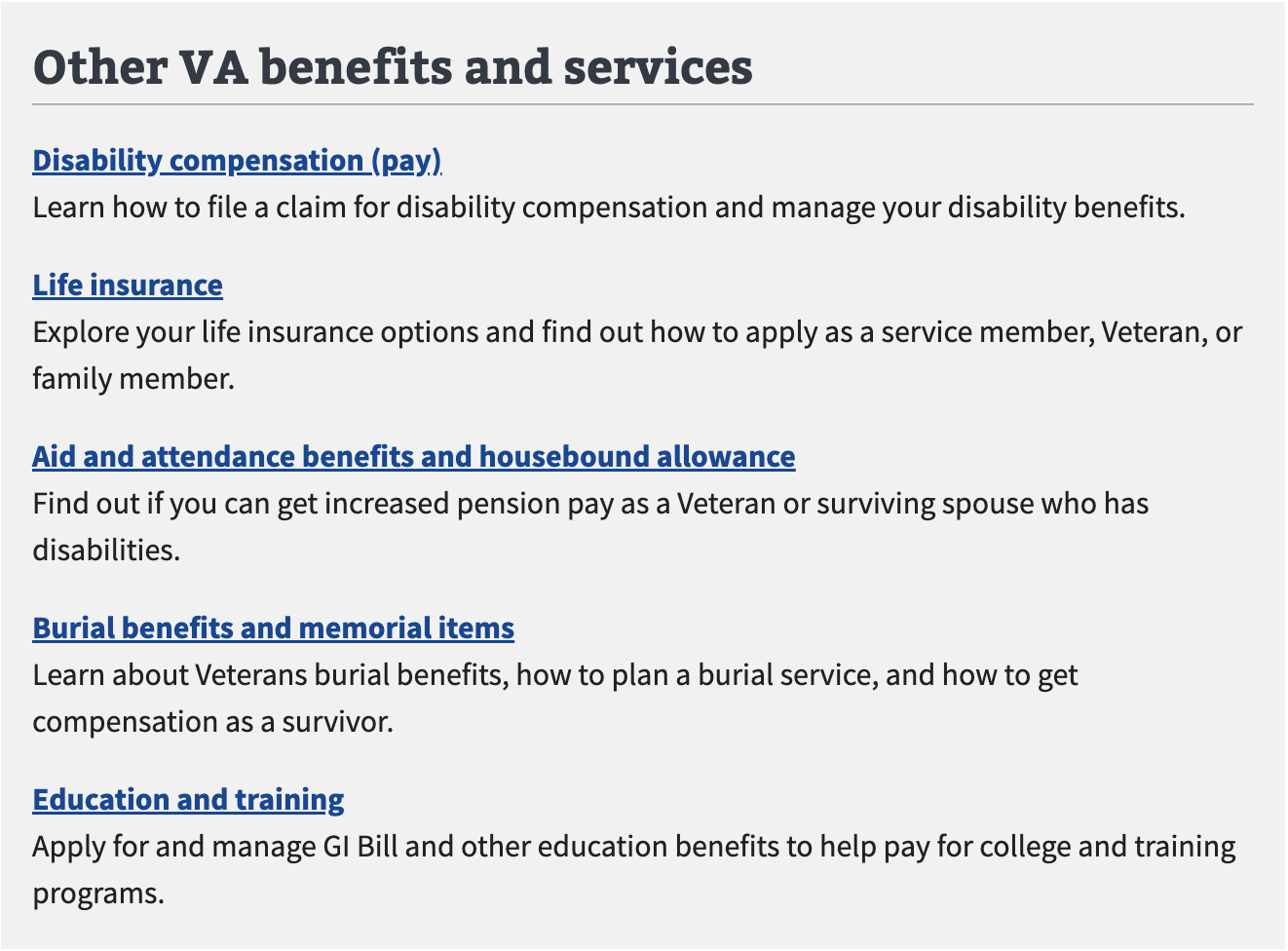
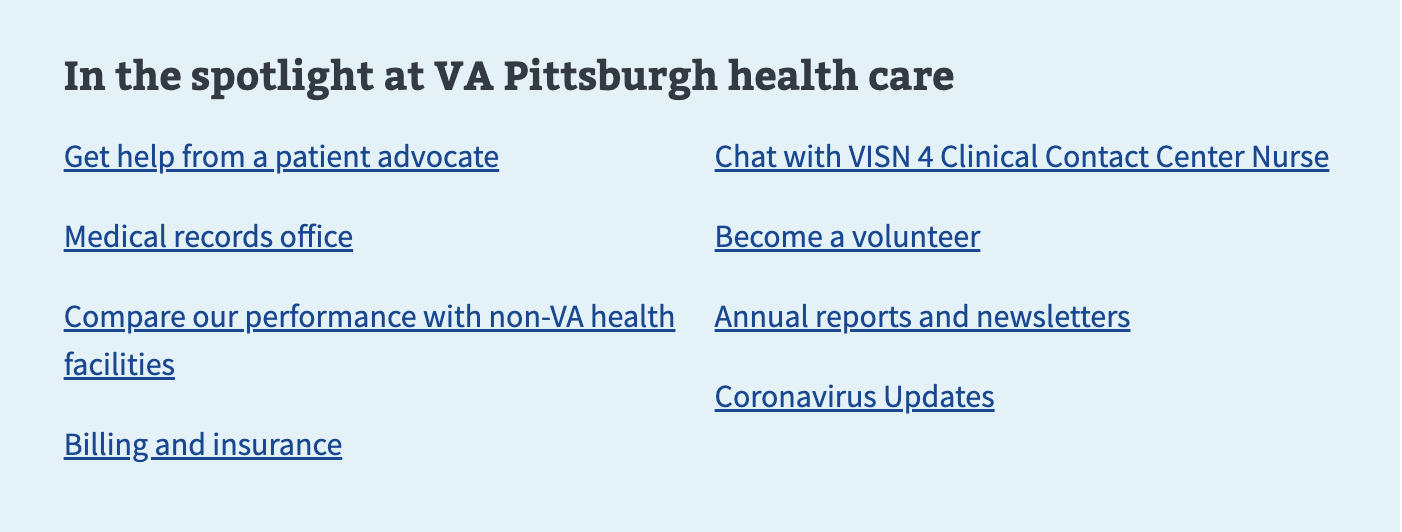
- Related content. Don’t use this component to highlight related information on, and drive Veterans to, other pages. Use related or major links, media cards, or stories (depending on template options) instead for this purpose.
- Table of contents. Do not use a Summary box component for a table of contents. Use the On this page component instead for in-page navigation.
- Dynamic highlight. If you’re highlighting something that was dynamically added to the page in response to a user action, use a variation of an Alert component.
- Time sensitive. If you have a message that will appear only for a defined period of time, use an Alert component instead.
- Sibling content. Use accordions to hold chunks of sibling content. For example, accordions are used in forms on the review screen.
- Additional context. To reveal helpful background information in a form use the Additional information component. Additional info is especially useful when the content is closely tied to a particular message or input on the screen. The lighter design prevents breaking up the visual progression as the user navigates the form. These can also serve as alternative to where accordions feel too heavy.
Placement
Summary box is found towards the top of the page after the h1 title of the page and intro text.
How to use the Summary box component
- Features must use a
h2,h3orh4heading depending on what the appropriate heading level is for your page based on the content of your page. - Also supports open text, such as
<p>,<ul>, and<ol>,<strong>,<em>, and<a>.
Variations
Instances of this component in production
Eligibility

Like this

Not this

Like this

Not this

Code usage
Code for this component is shown in Storybook. Follow the link provided in examples.
Content considerations
- Keep content brief. If there are more than 5 bullet points, the bullet points are longer than 20 words, or the bullet points require a header, image or button consider using simple body text, headings, and lists instead.
Accessibility considerations
Refer to the U.S. Web Design System for accessibility guidance
 View va-summary-box in Storybook