Components
Link - Deep content
Don't use: Deprecated- Contributors
- Jennifer Lee
The Link - Deep content component is now deprecated.
This component was not widely adopted, has no research backing it, and thus has been deprecated.
Examples

Purpose
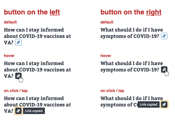
The purpose of the Link - Deep content icon (aka Copy deep link) is to help make navigating and finding information on very long pages a little easier. It does this in 2 ways, by:
- Letting users to easily copy the URL of a deep content (H3 subsection or information inside an accordion).
- Linking people (who received and clicked on the deep link URL) directly to the deep content.
Usage
URL pattern of deep links
The URLs of deep links must be unique while also providing some information scent. To meet the needs of both requirements, the URLs of deep links are autogenerated using this pattern:
- Take the page root URL and add on the first 30 characters of the H3 section or accordion title text plus the entity ID number.
- Example: va.gov/coronavirus-veteran-frequently-asked-questions/#are-va-national-cemeteries-ope-37235
See ticket #22385 for details.
Behavior

- On hover, the
Link - Deep contenticon state inverts. - When a user clicks/taps on the
Link - Deep contenticon, the icon shows a focus state and a message displays that the link has been copied. - The focus state and message remain for 10 seconds (or until the user acts on another
Link - Deep contenticon).
Clicking on the URL that was shared
When a recipient clicks/taps on the URL that was sent to them, they’re brought directly to the location of that deep content on the page.
- When the deep content is inside an accordion, the accordion is open on landing.
- When the deep content is not in an accordion but in an H3 subsection, the user-recipient is simply taken to that specific H3 subsection.
Code usage
<div aria-live="polite" aria-relevant="added text">
  <button aria-label="Copy link to RELEVANT_TEXT">
    <!-- SVG or va-icon -->
  </button>
  <div>
    <p>Link copied</p>
  </div>
</div>
Accessibility considerations
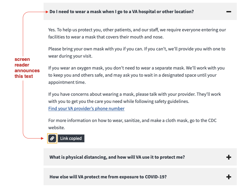
- On clicking/tapping, use a live-region to announce the “Link copied” text and keep the focus on the button.
- The accessible label will contain relevant, content specific titles for the screen reader to announce, e.g. “Copy link to [How can I stay informed about COVID-19 vaccines at VA]”.
Component checklist
Maturity
- Guidance
- Examples, usage, code usage, content considerations, and accessibility considerations are all complete.
- Research
- VFS team conducted research on this component which is linked from this page.
- Stability
- Component has been in production for more than 3 months with no significant issues found.
- Adoption
- Multiple teams have adopted this component.
Accessibility
While this component has been previously tested against older criteria, it has not yet been audited with the updated testing criteria.
Code assets
- Variations
- Storybook includes all variations (style, size, orientation, optional iconography, selection, error state, etc.)
- Responsive
- Component depicted in all responsive breakpoints.
- Interactive states
- Includes all interactive states that are applicable (hover, active, focus, keyboard focus, disabled).
- Tokens
- All design attributes (color, typography, layout, etc.) are available as tokens.
- Internationalization
- Describes i18n attributes.
Visual assets
- Variations
- Sketch library includes all variations (style, size, orientation, optional iconography, selection, error state, etc.)
- Responsive
- Component designed to work in all responsive breakpoints.
- Interactive states
- Includes all interactive states that are applicable (hover, active, focus, keyboard focus, disabled).
- Tokens
- All design attributes (color, typography, layout, etc.) are available as tokens.
Legend:
- Complete
- Incomplete
- Not applicable