About
Creating components
Setup
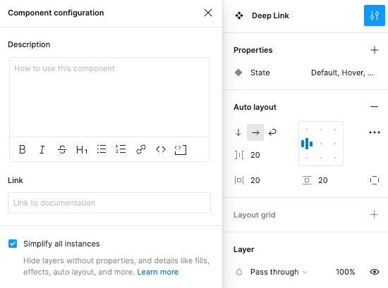
All components should have “Simplify all instances” checked. It helps reduce visual clutter when designers are using the components.
Documentation and naming
- Add a link to documentation on design.va.gov.
- Make sure the name matches the component name displayed in Storybook.
Construction
Auto layout
- Learn about using auto layout
- Explore auto layout properties
- Components must be set up to automatically resize vertically as text changes. Typically, a component’s height will need to be set to “hug” to accomplish this.
- Components must be set up for responsive widths. Here are some potential ways to achieve this:
- Variant widths may need to be set to “fill” at 1024px for desktop or 320px for mobile (Note: “fill” will only be available if this component is within a container.)
- Constraints may need to be set to “left and right” or “scale”.
- Autolayout properties may need to be customized depending on the component’s design.
Properties
- Explore component properties
- Properties should be listed in an order that mimics the component’s visual layout from top to bottom and left to right.
- For main components, show nested properties as appropriate.
- Properties should be named and set up consistently:
- Mode: Always appears first. Some options include Light and Dark or languages.
- Type: Appears below Mode. Used for things like Primary, Secondary, or H1, H2.
- Layout: Appears below Type. Used for things like Horizontal, Vertical, or varying quantities.
- State: Appears below Layout. Used for things like Focus, Active, or Open, Closed or Active, Inactive.
- Booleans should be named and set up consistently:
- Booleans can be used to show/hide icons, buttons, content, etc.
- Boolean names should be in the following format:
[Action] [Noun]. - The name should also agree with the true value. For example, “Show Icon” instead of “Hide Icon” or “Icon Show/Hide”.
- Instance swaps should be named and set up consistently.
- Preferred values should be set as appropriate.
- Always name them descriptively – i.e. icon (left) / icon (right).
- Text properties should be named and set up consistently.
- Add content fields for every editable content area.
- Header and title fields should be named descriptively – i.e. header / title or header 1, header 2, etc.
- Body copy fields should always be named “content”.
- Fields such as labels, tags, and buttons should be named descriptively – i.e. Button Text
- Naming should use title casing. For example, “Content”, “Title”, “Show Icon”.
- Layers should also be named descriptively and not “Frame 1”.
States
The following states should be depicted on all components:
- Default
- Hover
- Active
- Focus
Sub-components
For any sub-components that are used to build another component that should NOT be available to a designer using the library, prefix the component with an underscore or period (i.e “_” or “.”). This will make those components “private” to the current Figma file. It will not be exposed for a designer to use on it’s own when connected to the library.
Variations
The Design System Example Library will show a default variation and then any other variations the component supports. This may be as simple as the states listed above or a more complicated set.
In addition, all variations are shown at mobile and desktop viewport widths. If the design for a component doesn’t change it is acceptable to only show a variation at the narrowest width.
Design tokens
All components should be connected to the VADS Component Library styles & variables.
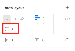
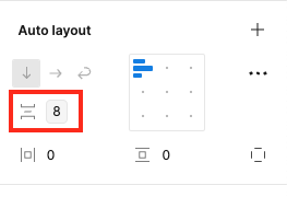
- All components should be connected to the proper style or variable/token.
- Colors: Connected to the correct color token (not primitive!) found in the local variables library.
- Typography: Connected to the correct text style found under local styles.
- Spacing: Connected to the correct spacing token or primitive.
- Icons: Connected to correct icon found on foundation page.
Visual quality
Color
All colors should be pulled from the variables in the VADS Figma file.
- All color combinations must pass color contrast at the following sizes and ratios.
- All text of 20px or smaller has a 4.5:1 contrast ratio to its background (or better)
- All text of 20px or larger has a 3:1 contrast ratio to its background (or better)
- Non-text elements have a 3:1 contrast ratio to their background and to neighboring elements (or better)
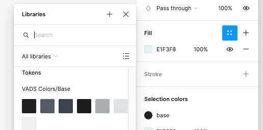
- Use variable tokens (NOT primitive) for colors. To find variable tokens, look under libraries when you select the color menu and scroll past the primitives collection to find tokens.
Typography
All text styles should be pulled from the VADS Figma file.
- Variables are not available for text so use local styles.
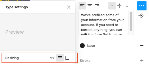
- Make sure your text uses the correct resizing:
- Auto width: Component will expand to the right when changing text.
- Auto height: Component will expand downward when changing text.
- Fixed size: Component will stay the same size regardless of the text changing.
Spacing
- Apply spacing variables whenever possible. Look for the logo below to access spacing variables.

Iconography
- Only use icons from the VA Design System. Our icons are a subset of USWDS icons. We aim to maintain consistency in semantic use by avoiding duplicating similar icons. If you have a need for an icon that doesn’t exist in our set, you may request a new icon to be added.
Quality assurance
There are multiple levels of quality assurance performed on components:
- Test of the design of the component in a design tool. The Design System Team tests components built in Figma (and Sketch, UXPin, et. al)
- Test of the built web component. The Design System Team then tests the component again once it is built as a web-component.
- Governance review of the component. Finally, the Governance team tests and reviews the component for design, content, information architecture, and accessibility. They also review the design assets and guidance on design.va.gov.
Some of the tests, such as color contrast checks, that the Design System Team performs will be re-tested by the Governance team in the built component. Thus ideally designers will perform these tests themselves when creating a component.
Preparing to test a component
- Connect your Figma design file to the Design System library found in the Assets panel, Team Library (open book icon).
- After connecting to the library, use the Assets panel to view all components.
How the Design System Team tests components
Essentially, we are looking for all of the things mentioned above.
Documentation and naming
- Does the component naming make sense and follow Storybook (if the component has been built)?
- Does the component link to guidance in design.va.gov?
Auto layout
- Components should be as reactive as possible. Most, if not all, components should be able to be resize for either mobile, tablet, or desktop viewport widths.
- The correct spacing should be applied to auto layout.
- Try to break the component!
- Test on instance and NOT main component.
- Expand/shrink the asset and put into containers.
- Change body text and/or header from a sentence to paragraph.
- Ensure text wraps correctly.
- Ensure the component expands or shrinks with additional text.
Properties
Not all components need every property. It will differ component to component. Test all combinations of properties.
- Variants: Should be used when the component has several states i.e primary, secondary, error.
- Boolean: Should be used if the component has a part that does not always need to be shown i.e icons, nested components and mobile view.
- Text: Should be used when the test on a component needs to be changed. There are some exceptions to this: If the component has several variants that need to have different/specific text. When you change the text on the main component it will change all of the variants.
- Instance Swap: Should be used if there is a part of the component that needs to be switched out but nothing else needs to change (i.e. iconography).
- Color contrast Review our use of color guidelines. Tip: The plugin “Contrast” can help with this check.
States
- Ensure that all states are shown.
Sub-components
- Ensure any sub-components are named correctly.
Variations
- If the component already exists in the system, ensure all variations match what is built in Storybook.
Tokens and variables
- All components should be connected to VADS Component Library styles & variables. Variables will start with “vads-“.
- All components should be connected to the proper style or variable/token:
- Colors: Connected to the correct color token (not primitive!) - can be found in local variables library.
- Typography: Connected to the correct text style - under local styles.
- Spacing: Connected to the correct spacing token.
- Icons: Connected to correct icon.