
Components
Privacy Agreement
Use: Deployed USWDS v3
Examples
Default
View va-privacy-agreement default in Storybook
 View va-privacy-agreement default in Storybook
Error
View va-privacy-agreement error in Storybook
Usage
When to use Privacy Agreement
For all forms that collect Personally Identifiable Information (PII). As stated in the VA Privacy Policy:
The VA.gov web pages that collect personal information will have a hyperlink to the Limited Privacy Policy that applies to that particular web page.
This is a requirement of the Privacy Act of 1974.
How this component works
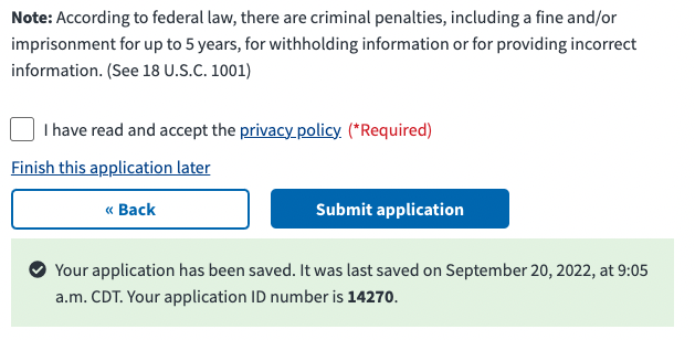
This component is used on the Review page of a form which is the last page in a form flow.
Behavior
- Privacy Policy link. When clicked, the link will open in a new browser tab. This behavior is identified by an icon with the arrow pointing up and screen reader text “opens in new tab”.
- Checkbox Toggle After reviewing the privacy policy content in a new browser tab, the user can select the checkbox to confirm that they have read and accept the privacy policy.
Placement
This component appears at the bottom of a form, above the link to “Finish this application later” which is directly above the button pair for submitting the form.
Instances of this component in production
Code usage
Attributes and Properties
| Property | Attribute | Type | Default | Description |
|---|---|---|---|---|
checked |
checked |
boolean |
false |
Whether the checkbox is checked or not. |
enableAnalytics |
enable-analytics |
boolean |
false |
Emit component-library-analytics events on the blur event. |
showError |
show-error |
boolean |
false |
Whether to display the error message or not. |
Events
| Name | Description |
|---|---|
component-library-analytics |
The event used to track usage of the component. This is emitted when the checked value changes and enableAnalytics is true. |
vaChange |
The event emitted when the checkbox changes. |
Accessibility considerations
Privacy policy opens in new tab or window. This component must detail to all users that the privacy policy link opens in a new window. This indication should be visible and auditory.
Component checklist
Maturity
- Guidance
- Examples, usage, code usage, content considerations, and accessibility considerations are all complete.
- Research
- VFS team conducted research on this component which is linked from this page.
- Stability
- Component has been in production for more than 3 months with no significant issues found.
- Note: This component was converted from React to a web-component in September 2022.
- Adoption
- Multiple teams have adopted this component.
Accessibility
While this component has been previously tested against older criteria, it has not yet been audited with the updated testing criteria.
Code assets
- Variations
- Storybook includes all variations (style, size, orientation, optional iconography, selection, error state, etc.)
- Responsive
- Component depicted in all responsive breakpoints.
- Interactive states
- Includes all interactive states that are applicable (hover, active, focus, keyboard focus, disabled).
- Tokens
- All design attributes (color, typography, layout, etc.) are available as tokens.
- Internationalization
- Describes i18n attributes.
Visual assets
- Variations
- Sketch library includes all variations (style, size, orientation, optional iconography, selection, error state, etc.)
- Responsive
- Component designed to work in all responsive breakpoints.
- Interactive states
- Includes all interactive states that are applicable (hover, active, focus, keyboard focus, disabled).
- Tokens
- All design attributes (color, typography, layout, etc.) are available as tokens.
Legend:
- Complete
- Incomplete
- Not applicable