Patterns
Help users to…
Know when their information is prefilled
Use with caution: CandidateUsage
When to use this pattern
- When you prefill the user’s data into an application, like a form. When using this pattern, clearly inform the user of where their data is being pulled from to prefill for them.
- When users can update prefilled information. Review Help users to… Know how their information is updated for guidance on helping users update this prefilled information.
Design principles
- Visibility of system status. This pattern demonstrates the usability principle of communicating the current state in order to allow users to feel in control and to be able to take appropriate action.
- User control and freedom. This pattern also gives users control over their own information thereby providing control and freedom.
When not to use this pattern
- For unauthenticated users. Users who aren’t signed in shouldn’t see their information prefilled when they interact with an application. But, when forms don’t require users to be signed in, they should see an information alert describing benefits to signing in. View the unauthenticated intro page alert later described on this page.
When to use caution
- When prefilling data from a source other than VA Profile. It is crucial to explain to the user exactly where the data is coming from so that if there are any errors in the data, it is clear how to correct them.
How to design and build
Anatomy or layout details
This pattern involves these types of pages found in VA.gov forms:
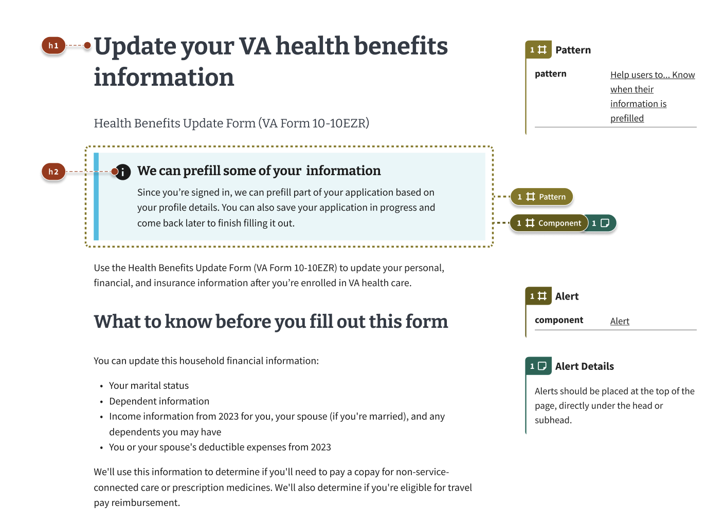
- Introduction page: The first page of a form. Introduces the process the Veteran or other beneficiary will follow to apply for a benefit or to complete a supporting form. Changes slightly after a user signs in.
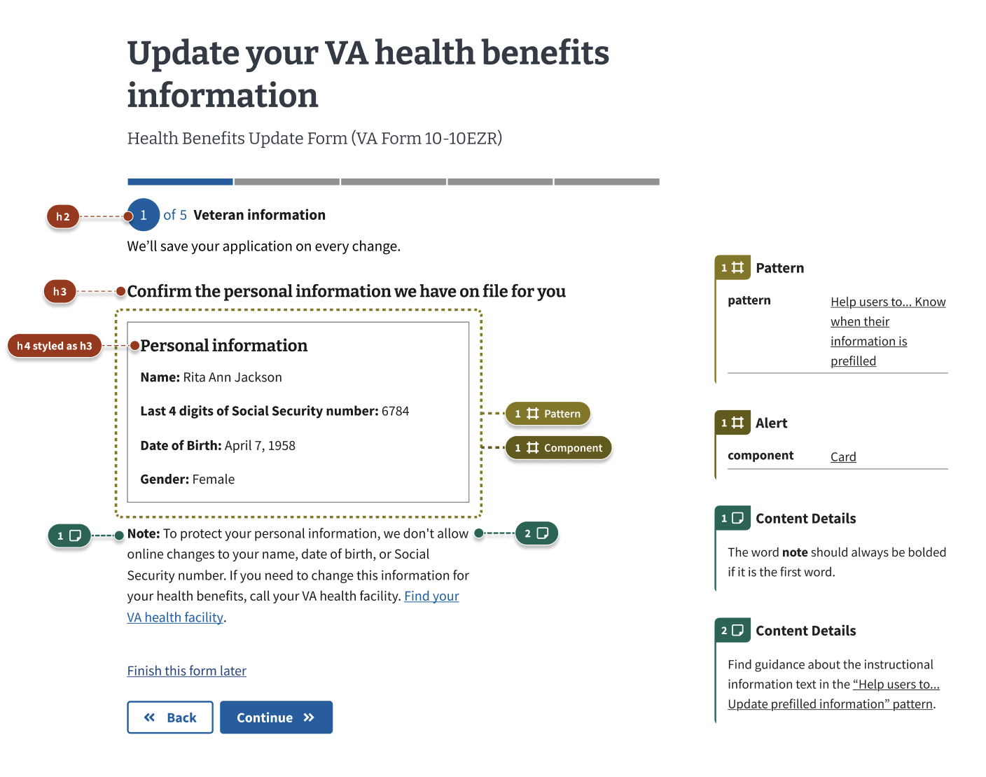
- Personal information page: Usually the first page of a form after the user signs in. Has personal details that cannot be edited online, like name, date of birth, Social Security number, etc.
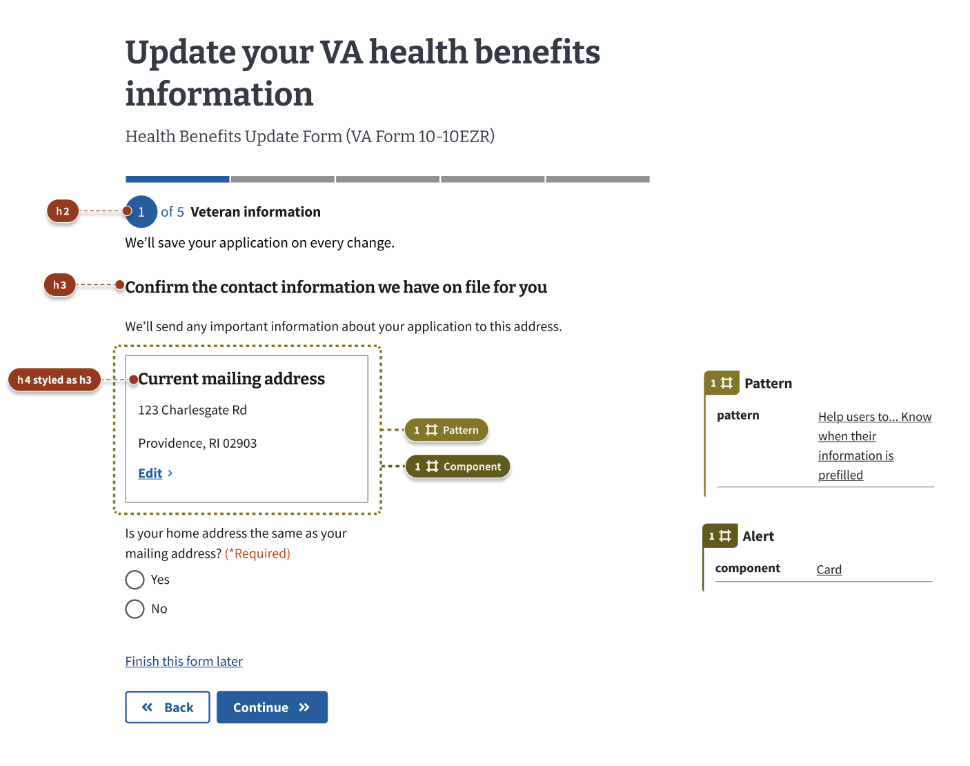
- Prefill edit pages: Any pages on which users edit prefilled data.
Introduction page
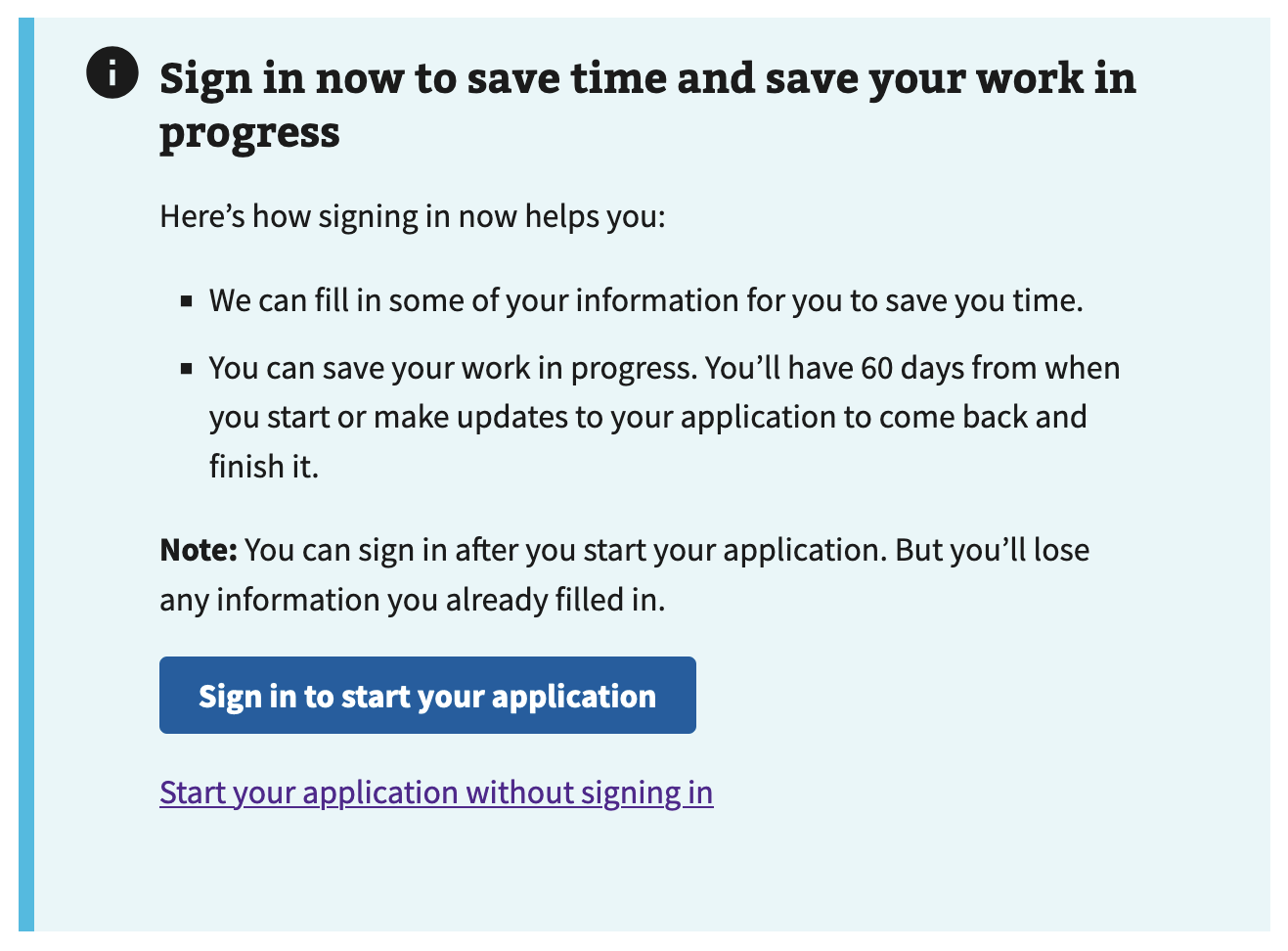
There are two states of an introduction page: Authenticated and Unauthenticated.


Personal information page

Prefill check page

How this pattern works
Communicate information that cannot be edited
This pattern communicates information that cannot be edited by:
- Omitting the edit link in cards with non-editable information. For information that cannot be changed online (such as legal name, date of birth, and Social Security number), remove the edit link within the card component.
- Including textual instructions for updating uneditable information. Under the card with the uneditable data, display informational text starting with the bolded word “Note:” followed by directions to update this information offline. See the “content considerations” section below for sample text.
Communicate information that can be edited
This pattern communicates information that can be edited by:
- Displaying editable prefilled information in a card with an edit link. Display prefilled information in a card component with a link to edit the information. This information may include contact information, such as phone, email, or mailing address.
Communicate where changes will save
- In most cases, save changes to the VA Profile. In user research, most users indicated that they want changes made to their information to update the information stored on their VA Profile. On the edit page, display an informational alert informing users that these changes will impact their profile information. This alert and others should be placed at the top of the page, directly under the form name.
Where needed, give users the choice of where to save
- In some cases, users want to choose where to save their information. This is especially relevant for information that may change semi-frequently. For example, when applying to refill and track VA prescriptions or medical devices, users may want to send to a temporary mailing address, and may not want this temporary mailing address to save to their VA Profile. In these cases, on the edit page, do not display the informational alert informing them where their changes will save. Instead, display a required radio button below the fields asking them if they also want to update this information in their VA Profile.
Display success alerts when information has been saved
- Inform users where the changes were saved. Display a success alert informing users “We’ve made these changes to this form and your VA.gov profile” or “We’ve made these changes to only this form.” This alert should be placed at the top of the page, below the stepper and text “We’ll save your application on every change.” Use a standard alert within the form steps. Use a slim alert if the user made changes from the final review page.
Components used in this pattern
Examples
Uneditable Prefill Card
View uneditable prefill alert in Storybook
Editable Prefill Card
View editable prefill alert in Storybook
Signed In Prefill Alert
View signed in prefill alert in Storybook
Unauthenticated Prefill Alert
View unauthenticated prefill alert in Storybook
Prefilled Info Alert
View prefilled info alert in Storybook
Examples in production
Coming soon!
Code usage
When using the va-card element to display prefilled information, ensure that the correct structure of the html is present. The description list <dl> and unordered list <ul> elements can be useful for displaying several pieces of uneditable data.
Uneditable information
Here is some example markup for a card of uneditable content that utilizes a description list.
<va-card>
  <div class="vads-u-padding--4 vads-u-margin--0">
    <dl>
      <dt class="vads-u-font-weight--bold">Name</dt>
      <dd>Godzilla</dd>
      <dt class="vads-u-font-weight--bold">Born</dt>
      <dd>1952</dd>
      <dt class="vads-u-font-weight--bold">Birthplace</dt>
      <dd>Japan</dd>
      <dt class="vads-u-font-weight--bold">Color</dt>
      <dd>Green</dd>
    </dl>
  </div>
</va-card>
Editable information
If a user can update their information, than pieces of information can be shown with a heading followed by the information itself, along with an edit link.
<va-card show-shadow="true">

  <h4 class="vads-u-width--auto vads-u-margin-top--0">
    Email address
  </h4>

  <p>testemail1234@unattended.com</p>

  <va-link
    label="Edit email address"
    href="/link-here"
    text="Edit"
    active
  />

</va-card>
View more prefill card examples on storybook
Content considerations
Directions for updating uneditable information
Directions for updating information that can’t be updated online vary. See the “Help users to… Update Prefilled information” pattern for guidance.
Unauthenticated intro page alert
[heading] Sign in with a verified account
[content] Here’s how signing in with an identity-verified account helps you:
- We can fill in some of your information for you to save you time.
- You can save your work in progress. You’ll have {time limit} from when you start or make changes to submit your form.
After you sign in, we’ll tell you if you need to verify your identity for your account.
Note: You can sign in after you start filling out your form. But you’ll lose any information you already filled in.
[button] Sign in or create an account
[text link] Start your form without signing in

Authenticated intro page alert
[content] Note: Since you’re signed in to your account, we can prefill part of your form based on your account details. You can also save your form in progress and come back later to finish filling it out.

Research findings
The Authenticated Experience Design Patterns team conducted user research in mid 2024 to gather validation about this pattern. The pattern was further tested as part of a late 2024 study by the same team.
 View uneditable prefill alert in Storybook