Components
Radio button
Use: Deployed English, Spanish, Tagalog USWDS v3
Examples
Default
Tile
View va-radio tile in Storybook
Hint text
View va-radio with hint text in Storybook
Label header
View va-radio with label header in Storybook
On background
View va-radio on background in Storybook
Forms pattern single
View va-radio forms pattern single in Storybook
Forms pattern multiple
View va-radio forms pattern multiple in Storybook
Error
View va-radio error in Storybook
Forms pattern single error
View va-radio forms pattern single error in Storybook
Internationalization
View va-radio internationalization in Storybook
Usage
Refer to the U.S. Web Design System for usage guidance
Choosing between variations
- Use the Hint text variation to provide additional information that pertains to the question being asked or all of the options presented.
- Use the Label header variation when a heading is required within the
legendthat acts as a label for the radio buttons. This can aid users in navigating the form questions, particularly in the sub-task pattern - Use the Description text variation to provide additional details about one or more radio button options. This variation is superseded by the Tile variation.
- Use the Tile variation to provide additional details about one or more radio button options within a large and well defined tap target.
Conditionally revealed fields
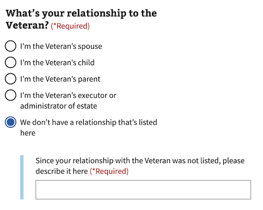
In the radio button and checkbox components, we offer an option to conditionally reveal fields when the user selects an answer. These fields are often used to group related questions together by revealing a single follow-up question only when they’re relevant to the user.
Conditionally revealed fields can be used if the following conditions are met:
- There should only be one reveal on a page.
- When the revealed trigger is selected, you must be able to tab directly into the newly revealed field (Which is why we’ve put the “other” question last.)
- The newly revealed question field must be understood by itself. For example, don’t just say “Other”. Instead, say:
Since your relationship with the veteran was not listed, please describe it here

Errors
- Refer to the specific error examples above.
View form error handling for additional guidance
Hint text
- Refer to the hint text example above.
View label hint text for additional guidance
Code usage
Attributes and Properties
| Property | Attribute | Type | Default | Description |
|---|---|---|---|---|
enableAnalytics |
enable-analytics |
boolean |
false |
Whether or not an analytics event will be fired. |
error |
error |
string |
A string with an error message. | |
formHeading |
form-heading |
string |
The content of the heading if `useFormsPattern` is true. | |
formHeadingLevel |
form-heading-level |
number |
3 |
The heading level for the heading if `useFormsPattern` is true. |
headerAriaDescribedby |
header-aria-describedby |
string |
An optional message that will be read by screen readers when the header is focused. The label-header-level prop must be set for this to be active. | |
hint |
hint |
string |
Optional hint text. | |
label |
label |
string |
The text label for the radio group. | |
labelHeaderLevel |
label-header-level |
string |
Insert a header with defined level inside the label (legend) | |
messageAriaDescribedby |
message-aria-describedby |
string |
An optional message that will be read by screen readers when a radio option is focused. | |
required |
required |
boolean |
false |
Whether or not this input field is required. |
useFormsPattern |
use-forms-pattern |
string |
Enabling this will add a heading and description for integrating into the forms pattern. Accepts `single` or `multiple` to indicate if the form is a single input or will have multiple inputs |
Events
| Name | Description |
|---|---|
component-library-analytics |
The event used to track usage of the component. This is emitted when a radio option is selected and enableAnalytics is true. |
vaValueChange |
The event emitted when the selected value changes |
keydown |
The event emitted when a key is pressed. |
radioOptionSelected |
The event emitted when the selected option value changes. |
Content considerations
Refer to our bulleted list guidance for punctuation and general considerations
Accessibility considerations
Refer to the U.S. Web Design System for accessibility guidance
 View va-radio in Storybook