Components
Breadcrumbs
Use: Deployed USWDS v3
Examples
Default
View va-breadcrumbs in Storybook
Default at mobile viewport width
View va-breadcrumbs in Storybook
Rerender state
View va-breadcrumbs v3 and adjust state in Storybook
Wrapping state
View va-breadcrumbs v3 wrapping state in Storybook
Usage
Refer to the U.S. Web Design System for usage guidance
Additional guidance for VA
When to use
- Hierarchies more than 2 levels. Use a breadcrumb when the section of content is more than 2 levels deep.
- Include one, include all. If you use a breadcrumb for one page in a hierarchy, use a breadcrumb for all pages within that hierarchy.
When to consider something else
- Simple sections of the site. Do not use a breadcrumb if the section of the site is not every deep (i.e. only 2 levels of content or less)
- Irrelevant hierarchy. Do not use a breadcrumb if the path or hierarchy of the page is irrelevant to the user or experience.
Usability guidance
- Hierarchical relationships, not linear paths. Breadcrumbs should be based on content hierarchy, not on the user’s click path or browser history. For online applications and forms, the breadcrumb represents the forms’s placement within the site hierarchy, it does not track the steps or progress of the form flow.
- Match the text of the title (h1). Breadcrumb segment text must match the text of the title (h1) text of a corresponding page and not be an abbreviation or variation of that title. When writing H1s for a page, follow the content styleguide for writing page titles. Start with “VA.gov home”. Clearly indicate that the home page is the VA.gov home page. This clarifies placement within broader VA.gov site, and ensures there’s no confusion between the VA.gov home page and the landing page of a section of the site.
Breadcrumbs in form flows
- In form flows, the breadcrumb should only show up to the form introduction page as the final segment, and maintain that display while the user progresses through the flow. This allows the user to easily get to the beginning of the form flow. Forward and backward CTAs can be provided within the page to allow page by page navigation. The breadcrumb works in concert with the Progress bar - Segmented component to provide context for where a user is in a process and on the site.
- When using the Header - Minimal, the breadcrumb can be removed to further prevent the user from easily navigating away and not not accomplishing their main task. In this case, the breadcrumb can be replaced with a “Back” link that allows the user to navigate backwards in the flow.
Placement
- The breadcrumb should be placed below the header and above the main content.
- The placement of the breadcrumb must be consistent from page to page.
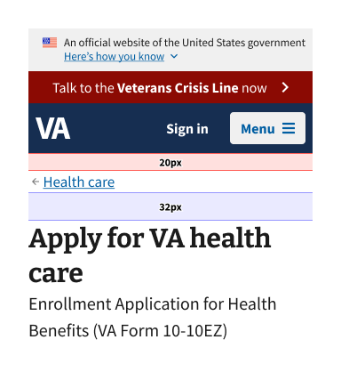
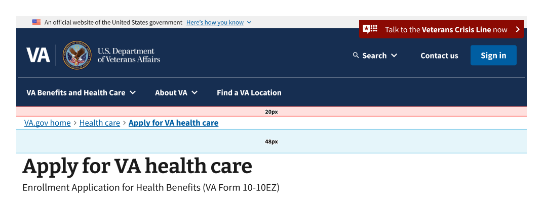
- Spacing for the breadcrumb is built in to the component and should be consistent throughout all layouts. The correct spacing is specified in the images below:


Behavior
- All links in the breadcrumb should be interactive and link to their corresponding page, or in the case of the current page link, link to content on the current page.
SEO considerations
- Search engines utilize breadcrumbs to understand your site structure and gain additional context about your page to help in ranking.
- Breadcrumbs can also be displayed in search engine results pages (SERPs), which provides additional context to users about your page.
- Breadcrumbs are not the only element used by search engines, go to writing for SEO in the content styleguide for more SEO assistance.
Code usage
Attributes and Properties
| Property | Attribute | Type | Default | Description |
|---|---|---|---|---|
breadcrumbList |
breadcrumb-list |
Breadcrumb[] | string |
Represents a list of breadcrumbs. Use a JSON array of objects with label and href properties, then wrap in a string if using non-React-binding version. See Storybook examples for React-binding version. For pure web components, here's an example link: ``[{"href": "/link1", "label": "Link 1"}]`. | |
disableAnalytics |
disable-analytics |
boolean |
false |
Analytics tracking function(s) will not be called |
homeVeteransAffairs |
home-veterans-affairs |
boolean |
true |
When true, the first breadcrumb label will be "VA.gov home". |
label |
label |
string |
'Breadcrumb' |
Adds an aria-label attribute to the element. |
wrapping |
wrapping |
boolean |
false |
Whether or not the component will wrap the breadcrumbs. |
Events
| Name | Description |
|---|---|
component-library-analytics |
The event used to track usage of the component. This is emitted when a breadcrumb anchor is clicked and disableAnalytics is not true. |
routeChange |
Fires when user clicks on breadcrumb anchor tag. Has no effect unless the href of anchor tag is part of breadcrumb object that also has isRouterLink: true |
Router link support
To use React Router with this component follow these instructions.
Content considerations
- Use “VA.gov home” as the default home crumb title. This component will default to “VA.gov home” for the first crumb. This is the preferred content for this crumb. Deviation from this should only be done with express permission from CAIA.
Accessibility considerations
Refer to the U.S. Web Design System for accessibility guidance
Additional accessibility guidance for VA
- Make current page a link. Use a link for the current page for robustness. While it may sound counterintuitive to link to the current page in this component, it makes sense to include this as a link so screen readers voice the current page link whether the user navigates by element or by tabbing. Making the current page a link rather than text makes it a focusable and clickable element. It also follows WAI-ARIA Authoring Practices Guide (APG) guidances which states that an
aelement witharia-current="page"should represent the current page.
 View va-breadcrumbs in Storybook